
Cta 22 block design & features
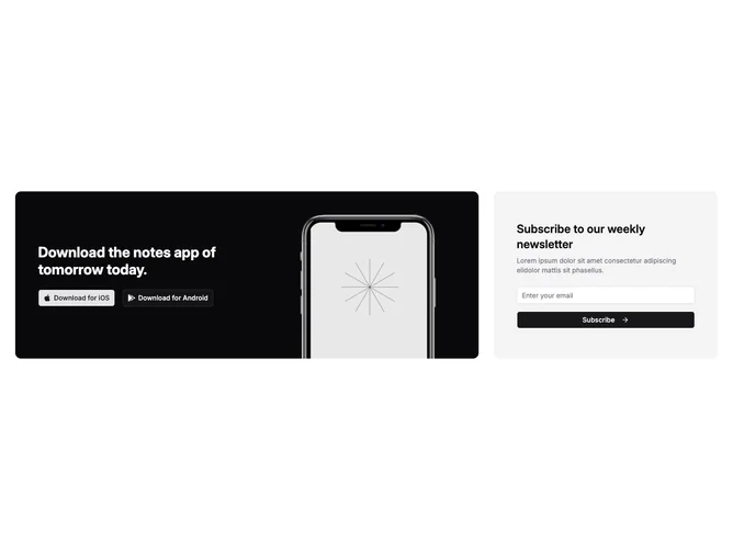
Cta22 combines an app-store pitch with email capture inside one responsive grid built with Shadcn UI pieces. On wide layouts the first row spans two columns of a three-column grid and hosts a dark rounded tile with white typography, paired App Store and Play-style buttons using recognizable marks, and a phone mockup column that only appears once medium breakpoints give enough horizontal room. The remaining column is a muted rounded panel with its own heading, supporting paragraph, email field, and full-width submit button paired with an arrow icon.
Contrast between the deep promo slab and the softer signup tile keeps both zones readable. The handset imagery overlaps its backdrop container with rounded top corners so hardware reads dimensional against flat UI chrome.
This block trends elaborate because it mixes illustrative photography, dual-channel messaging, and a validated signup path in one band. Expect to replace hardcoded marketing strings if you ship it beyond the demo narrative.
The newsletter tile stays hidden on the smallest breakpoints while the download tile remains primary; once small screens widen past the flex breakpoint the signup module appears beside the promo content before the grid snaps into three columns on large screens.