
Contact 14 block design & features
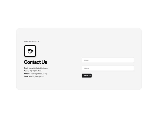
Contact14 packs a split layout into one large muted card built with Shadcn UI. The left side shows a small label, a framed avatar, a headline, and lines for email, phone, address, and hours. The right side keeps only name and phone fields plus a single action button for a fast callback ask.
Corners stay very round and padding stays generous. The avatar sits inside a nested square frame with a dark outer band and light inner mat so the portrait reads like a badge. Detail rows pair muted labels with values picked out by underline, while inputs stay bright against the card ground.
Visually the frame-around-avatar is the memorable motif; everything else stays calm so the card reads as a compact profile panel plus minimal capture rather than a long survey.
The two-track grid collapses to a vertical stack on small screens while keeping the same content order.