Compare 2 block design & features
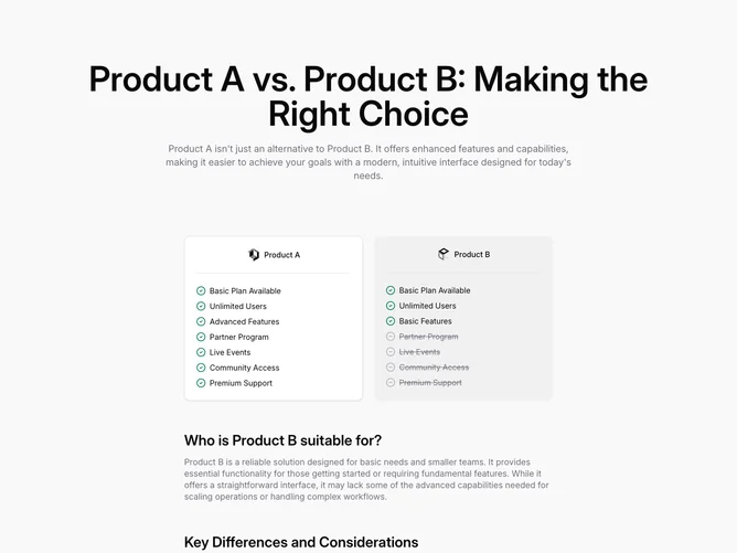
Compare2 is a product comparison section built with shadcn/ui pieces, opening on a soft tinted page background with a very large centered title pairing Product A against Product B and a wide muted introduction that argues for the newer option. Below, a two-column grid capped near three-column width presents paired cards: Product A sits on a bordered background panel with logo, a horizontal divider, and a vertical list where every line uses a green check icon; Product B mirrors the structure but shifts some rows to muted, struck-through text with hollow minus icons for partner program, events, community, and premium support while keeping basic items checked.
The lower half drops back to full-width prose blocks with sizable subheads, first asking who Product B fits, then listing key differences in a second long paragraph, both in muted body color for calmer reading after the dense lists. Thin separators from shadcn/ui sit between each logo strip and checklist, so the layout mixes marketing display type with checklist density.
It is more verbose than a single table because of the narrative section, so expect to rewrite both list items and paragraphs together for coherence.
Responsive behavior stacks the two product cards before the essay-style explanations, preserving the left/right comparison order on medium screens and above.