
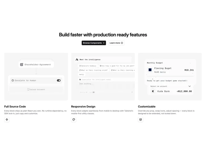

Feature 182 block design & features
Feature182 is a hero-adjacent feature trio built with shadcn/ui Button wiring and content-pack-friendly props. The upper band centers a multi-line heading with generous line height, then layers two calls to action: a solid primary button with trailing arrow and a full-width-on-mobile outline companion using a small verification-style icon as punctuation. Below, three feature columns share one responsive grid that becomes two columns on medium screens and three on large, always capped at three items.
Each column leads with a wide landscape image clipped to rounded corners and anchored near the top, followed by prominent title typography, subdued supporting copy in a smaller size, and a tight bordered square that frames the illustrative icon supplied by props.
Visually restrained: soft spacing, monochrome-with-accent button pairing, reliance on photography or illustration thumbnails to carry warmth. Complexity is modest in structure but content-heavy because strong imagery anchors the composition. Compared with icon-only grids, this block reads more like a showroom row.
On phones the headline and buttons stack with full-width taps, while cards become single-column narratives that keep image-first ordering for continuity.