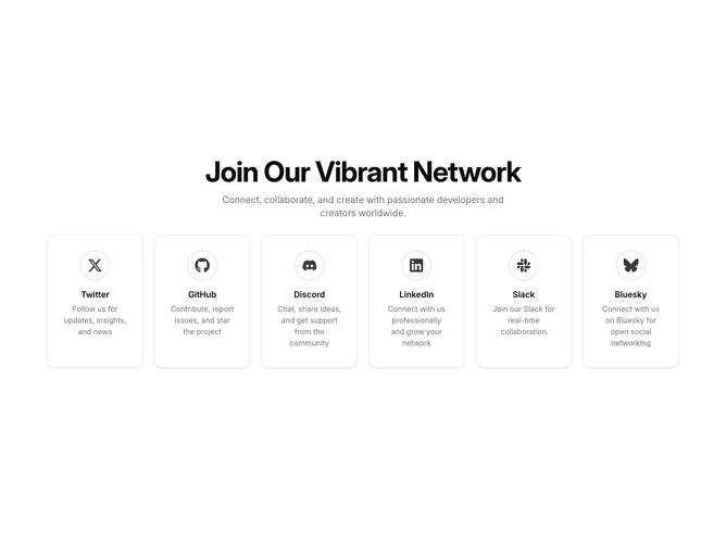
Community 6 block design & features
Community6 wraps content in a rounded, full-width panel with generous vertical padding and centers a heavy display headline plus a muted supporting sentence, using shadcn/ui cards for each destination. Under that, the six cards form a grid that is one column on phones, three on medium screens, and six across extra-large widths. Each card links vertically through a dotted circular ring that holds the platform icon, a semibold title, and a short muted description for Twitter, GitHub, Discord, LinkedIn, Slack, and Bluesky.
The dotted rings pick up a muted fill on hover while the cards gain a stronger drop shadow, so motion is restrained but visible. Typography is headline-forward at the top with smaller body copy inside each tile.
This reads as a bold, network-style hub rather than a quiet footer row: the wide headline and six equal cells make it feel expansive. Content load is moderate because you must supply six parallel blurbs and destinations, but the layout itself is repetitive and predictable.
Because the final breakpoint fans out to six columns, very wide displays show all channels at once while phones scroll through a single column stack.