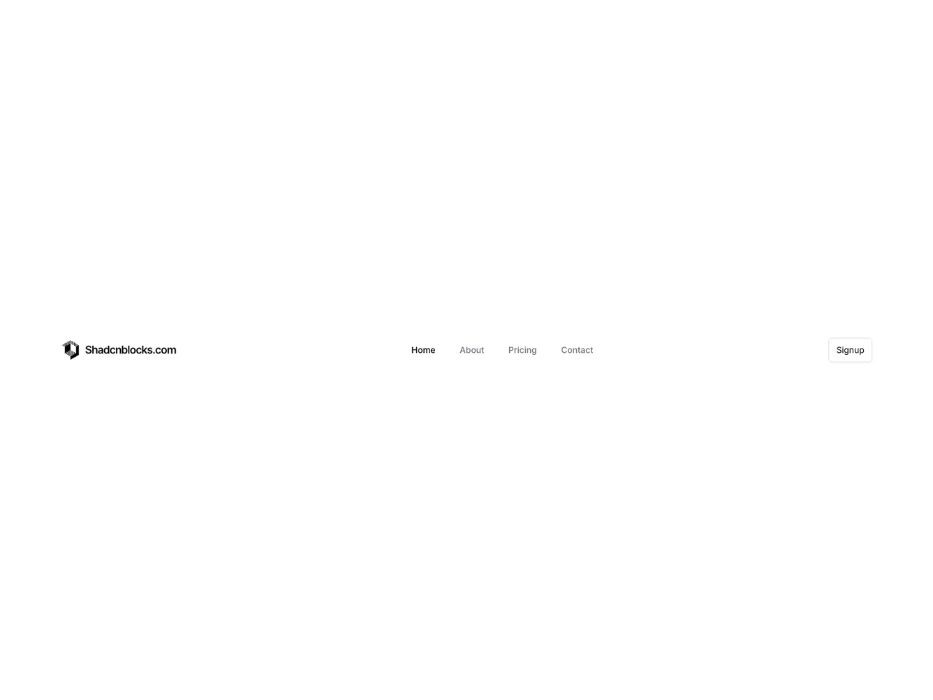
Shadcn UI Navbar Block
Navbar17 is a sophisticated navigation component tailored to enhance user interaction and accessibility. It provides a structured way for users to navigate through different sections of a website, maintaining a consistent and intuitive design. Ideal for situations requiring a polished layout, this component exemplifies the shadcn block's seamless integration of functionality and aesthetics, making it a versatile choice for any web interface.
Designed with flexibility in mind, Navbar17 incorporates essential navigation features along with distinguishing enhancements like an animated active indicator and a dynamic mobile popover menu. This component's dual-layout approach—catering to both desktop and mobile environments—ensures a cohesive user experience across devices. The integration of a shadcn ui button for user actions like sign-ups further adds to its utility. The active element highlights in response to user interactions, creating a fluid and responsive navigation mechanism that aligns with modern web design practices.
Dependencies
| Package | Type |
|---|---|
| lucide-react | NPM |
| react | NPM |
button @shadcn | Registry |
navigation-menu @shadcn | Registry |
popover @shadcn | Registry |
