Feature 149 block design & features
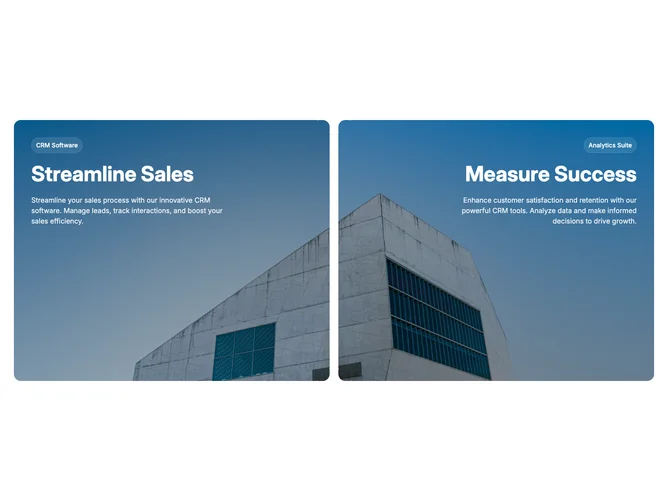
Feature149 contrasts two narratives inside one photograph-built frame using shadcn/ui buttons styled as translucent pills over darkened overlays. Structural layout stacks panels vertically on handheld widths sharing the same anchored background snapshot with rounded enclosure, each column carrying label control, commanding headline in white, plus supporting copy with opposing text alignment cues on widest layouts. Between halves a sculpted vertical strip only appears once horizontal room allows, using negative radius shadows to carve concave bites out of adjoining panels.
Color story leans cinematic: tinted black gradients modulate readability, translucent borders echo glassy controls, typography stays high contrast atop imagery, gradients intensify subtly when hovering on desktop widths through width tweening emphasizing whichever story users engage. Interaction focus centers on pointer hover rather than scroll choreography.
Mood reads premium and campaign-like with explicit dual-offer storytelling; complexity is moderate interaction plus art direction because background photo and paired message sets must align tonally. Implementation leans on layered absolute stacks and group hover utilities for the animated emphasis.
On small screens panels stack with fixed shorter heights while shared photo still spans entire section preserving continuity without the sculpted gutter treatment.