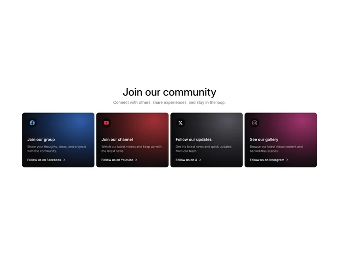
Community 4 block design & features
Community4 is a centered intro (large title and muted subtitle) followed by a grid of four linked tiles for Facebook, YouTube, X, and Instagram built without extra Shadcn UI wrappers beyond utilities. Each tile is a dark, rounded rectangle with a radial glow keyed to a platform hue, a subtle dot-grid veil, and a circular emblem that frames the tinted brand icon. The lower half carries a short heading, a lighter explanatory sentence in reduced opacity white, and a bottom row with follow copy plus a ChevronRight that nudges forward on hover.
The look is high contrast: white typography on near-black panels, color coming from glows and icon fills rather than flat brand blocks. Cards stretch evenly in height with internal spacing that separates the icon cluster from the text block.
This is a more decorative take on a social grid than bordered light cards: the per-platform gradients and texture layer are the main personality. Expect to tune colors and copy per network; the structure is still a simple four-item grid at heart.
The layout goes one column, then two, then four across the widest breakpoint, so each card remains a full-width poster on phones.