

Signup 10 block design & features
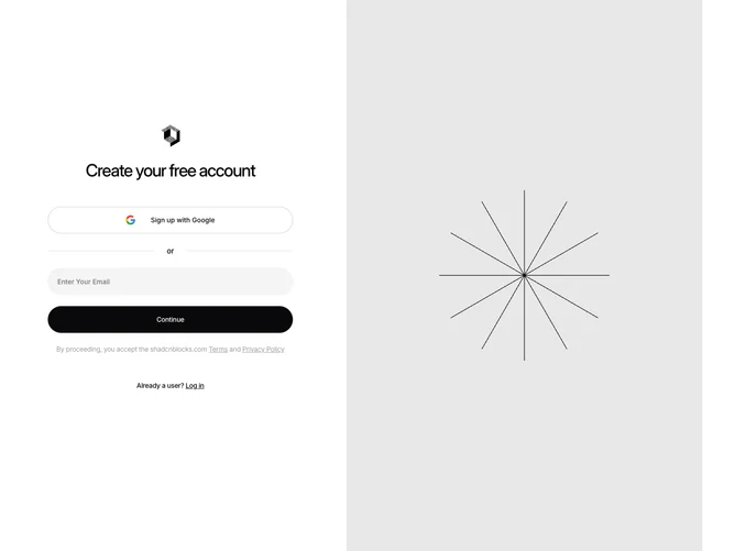
Signup10 is a two-column signup section built with Shadcn UI. The left column centers a logo, a heading, a pill-shaped Google sign-up button, an or divider, a pill-shaped email input, a pill-shaped continue button, terms and privacy copy, and a login link. On large screens a full-height image fills the right column.
Interactive controls share a tall pill shape. The Google button is outlined. The email field uses a muted fill with no visible border. The continue button inverts to a dark fill with light text. Legal copy is small and faded. The image column is a muted full-bleed photo area.
The pill language and split image give this a more current, consumer-app feel than a boxed form. Moderate complexity from the two-column split and the number of auth plus legal elements. You need a logo, a tall image, and the usual terms and login copy.
On smaller screens the image column hides and the form stays centered in a single column.