Logos 4 block design & features
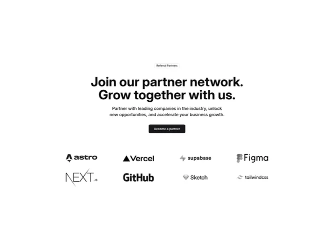
The Logos4 component serves as an engaging promotional section designed to attract potential partners by showcasing a collection of reputable logos. It features a compelling headline and a call-to-action button, encouraging users to join a network of referral partners. This section is strategically crafted to enhance user interaction and convey trust by displaying logos of prestige brands.
The component is structured to present a balanced and inviting layout. At the heart of the component is an inviting message, complete with a header and a subheading, providing a clear incentive for collaboration. Supporting the message, a grid layout displays partner logos in a visually cohesive manner without overpowering the call-to-action. Featuring a mix of the shadcn ui components like badges and buttons, this design highlights both function and aesthetics.