Navbar 18 block design & features
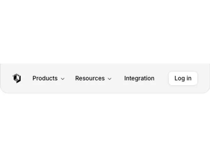
Navbar18 is a sophisticated navigation component designed to streamline user interaction and provide quick access to essential site areas. It combines a logo and dynamic menu structure with a login button, creating a cohesive and user-friendly interface. Featuring both desktop and mobile views, it integrates several interactive UI elements such as accordions, popovers, and navigation triggers to enhance the user experience. By leveraging a structured approach to menu navigation, the Navbar18 offers a seamless transition between pages with visually appealing menu items.
In greater detail, Navbar18 effectively manages navigation by incorporating complex dropdown structures with submenus. These structures include detailed descriptions for each submenu item, providing users with context and guidance during exploration. The component adapts its layout for smaller screens by utilizing a compact format with a popover-triggered mobile menu. This mobile menu uses an accordion to organize items further, ensuring a clean and accessible layout. The integration of visual elements like icons and hover effects adds an additional layer of elegance, promoting an engaging interaction through the shadcn block design ethos.