

Feature 168 block design & features
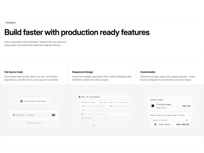
Feature168 is a Shadcn UI marketing rail built from Badge plus a responsive grid fed by the shared feature-card-list props. A top container band mirrors the bottom spacer, each sandwiching horizontal rules so the section reads like a boxed editorial column. The header row pairs an outline badge using a PocketKnife icon with an oversized balanced heading and optional description in muted text.
Below, a three-column grid on large screens uses single-pixel separators from the border token, so each column remains flush without card shadows. Every cell stacks a semibold title, muted paragraph, and a wide image inside generous padding on a muted field, cropped from the top for consistent headroom.
The result feels showroom-clean and slightly magazine-like, emphasizing rhythm and negative space over chrome. Default content comes from the placeholder pack merged in the component, so replacing headings, badge label, and three feature objects is the main integration task.
At mobile widths the grid divides vertically first, then expands into columns when space allows, keeping the rail borders intact.