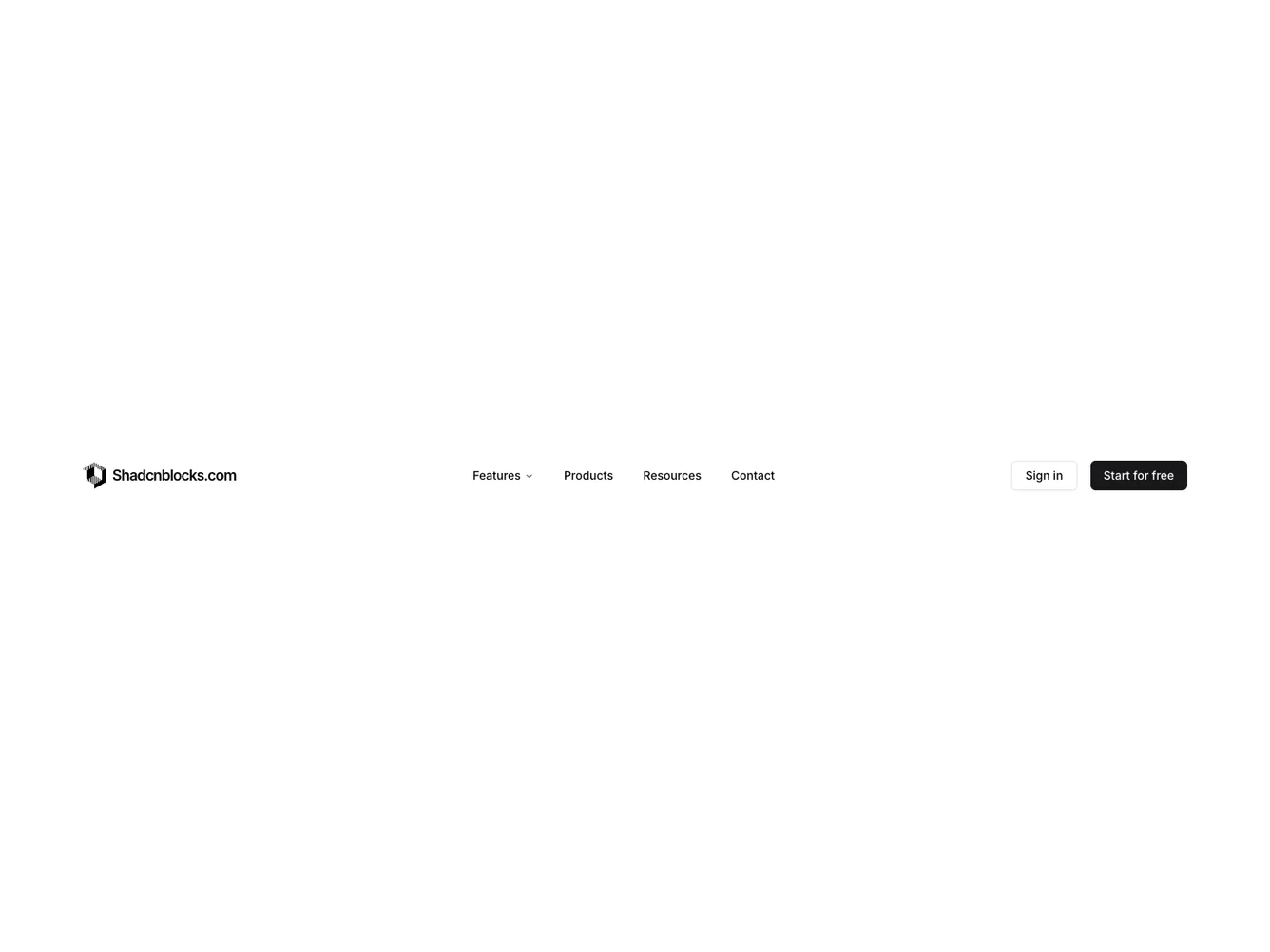
Shadcn UI Navbar Block
The Navbar5 component functions as a versatile navigation bar designed for web applications. It integrates a responsive navigation menu, allowing users to explore key features, browse products, access resources, and contact information. The navigation structure optimizes user interaction with expandable menus, offering direct links to a variety of sections, enhancing the user experience.
The component's detailed design includes a sophisticated use of the Shadcn UI block to offer a structured view of navigation items. It features a horizontal layout for larger screens and a collapsible menu for smaller devices, ensuring smooth access to content across all platforms. The key components like NavigationMenu, Sheet, and Accordion are harmoniously orchestrated to handle different screen sizes effectively, accommodating the navigation needs of dynamic applications.
Dependencies
| Package | Type |
|---|---|
| lucide-react | NPM |
accordion @shadcn | Registry |
button @shadcn | Registry |
navigation-menu @shadcn | Registry |
sheet @shadcn | Registry |
