Compare 3 block design & features
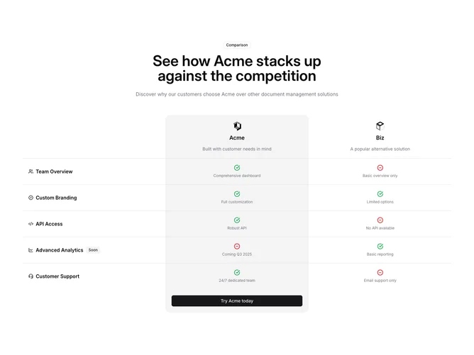
Compare3 is a marketing comparison section built with shadcn/ui. The top stacks a small outline “Comparison” badge, a wide centered title and supporting line, then a wide three-column matrix. The first column lists feature names with small Lucide icons. The middle column is the highlighted product: logo, name, tagline, muted column background, rounded top corners, and green check or red minus icons with short captions per row. The third column mirrors the competitor with a plain header cell and the same row pattern. One row adds a secondary badge for a future capability, and the grid ends with an empty corner cell and a rounded-bottom cell that holds a full-width “Try” style button.
Borders separate every row, the emphasized column reads as a card inside the table, and icon color carries most of the meaning (green for strength, red for gaps). Typography is bold for row labels and product names, with smaller muted text for cell notes. The section uses generous vertical padding and a container width that keeps the matrix readable on desktop.
This is a familiar “us versus them” layout with clear affordances rather than subtle styling. The structure is moderate in complexity because you supply brand assets, feature copy, and which side should read as preferred, while the visuals stay close to defaults.
The comparison area can overflow horizontally with padding compensation so cramped viewports scroll sideways instead of squashing the three columns.