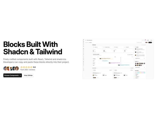
Free Shadcn UI blocks
Browse 106+ free blocks built with React, shadcn/ui and Tailwind CSS. Copy & paste the code or install with the Shadcn CLI. See all categories on the full blocks library.
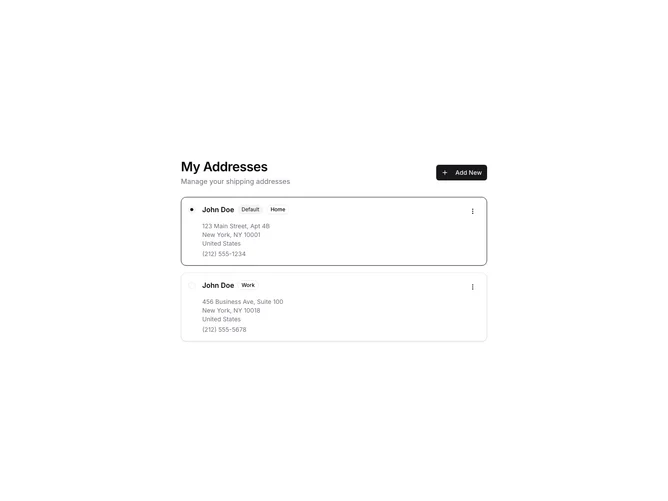
Address book list with edit modes and default selection
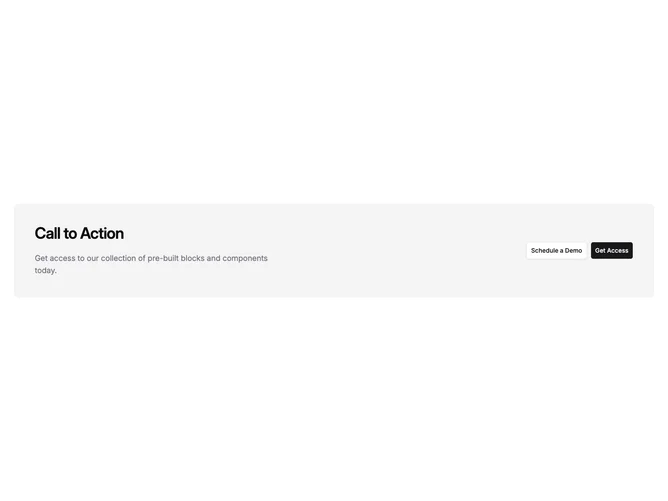
Banded call-to-action with dual buttons
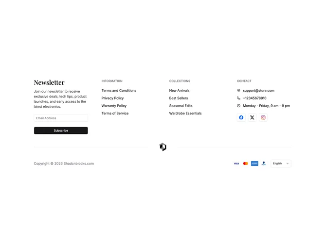
Ecommerce footer with newsletter, language selector, and contact row
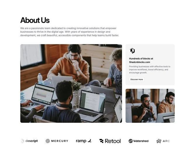
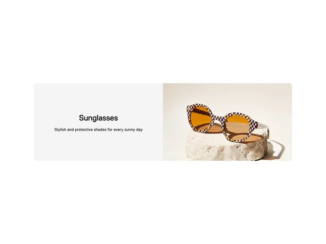
Two-column feature with square image and button
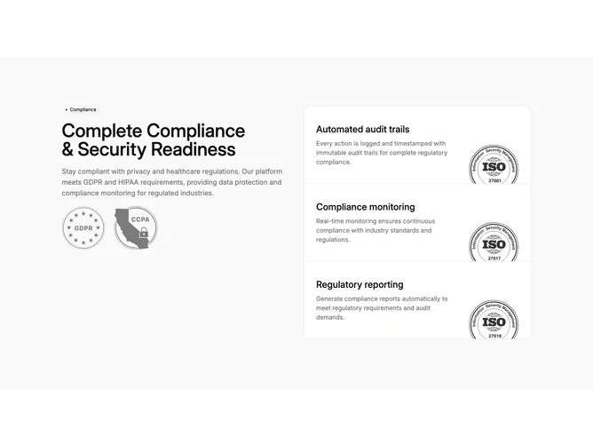
Two-column compliance narrative with stacked detail cards
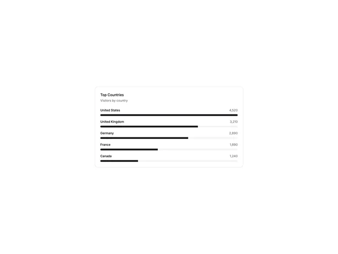
Leaderboard with Progress Bars
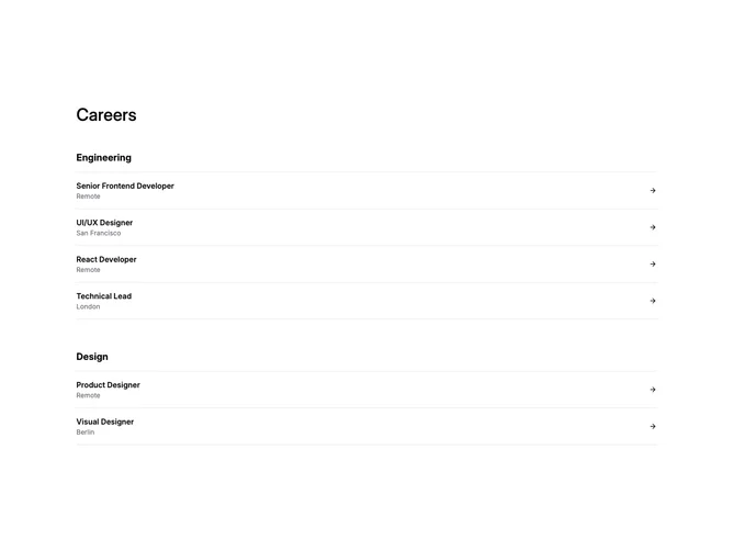
Simple careers heading with category sections
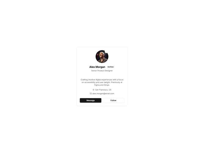
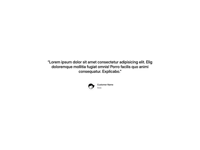
Basic Profile Card

Centered hero with ratings row under single CTA
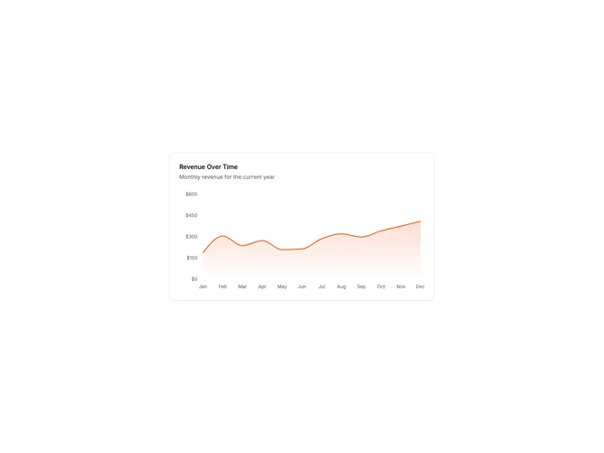
Area Chart Card
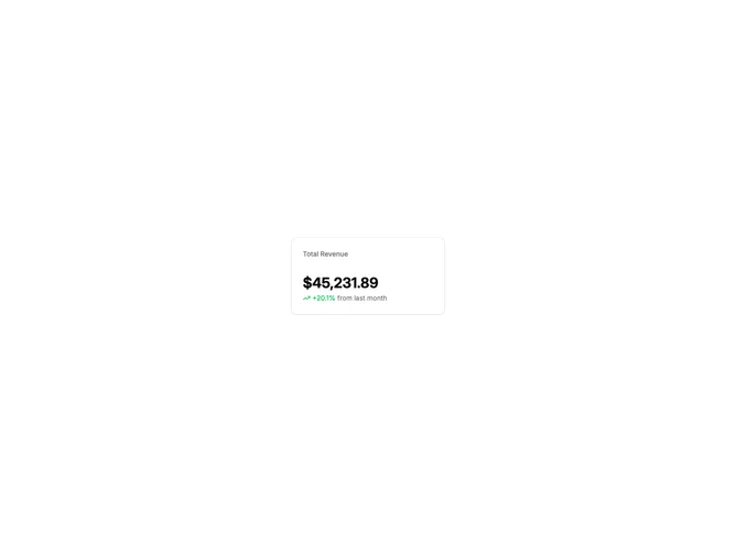
Metric Card with Trend
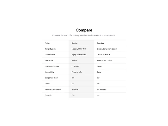
Compact three-column comparison table with tooltips
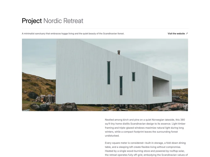
Split hero with image on the right
Centered invite with logo and outline social buttons
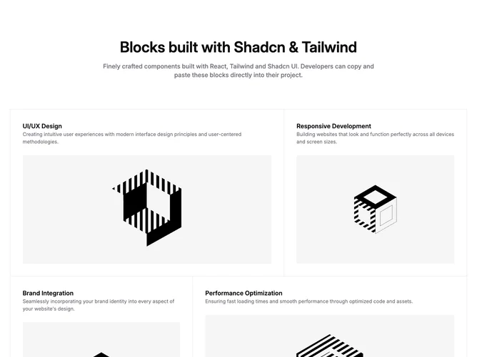
Two-column feature cards with linked titles and imagery
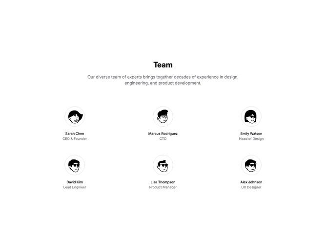
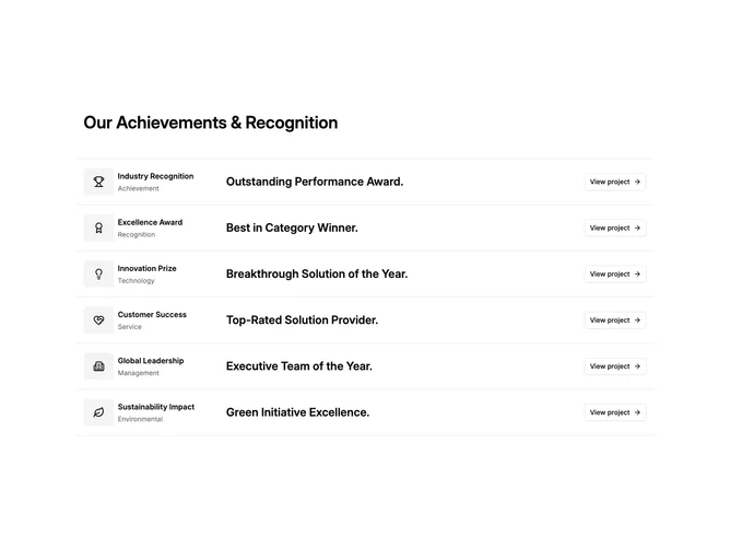
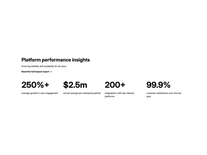
Company Profile with Achievements
Navbar with icon dropdown menus
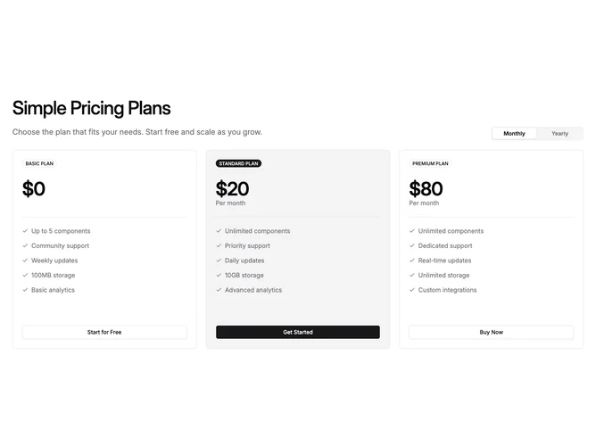
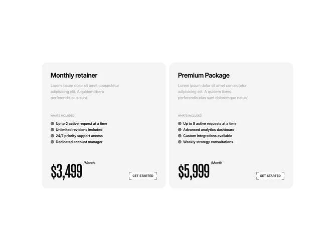
Three-plan pricing with tabs and one highlighted column
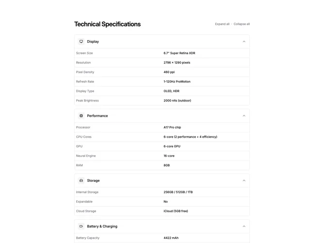
Centered article with alert and table
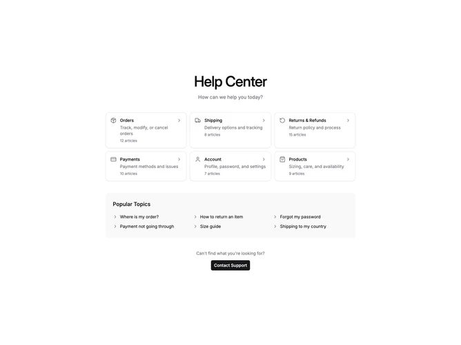
Category Cards Help Center
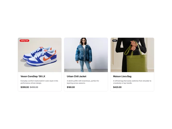
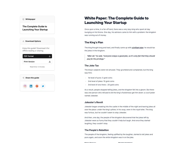
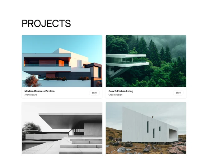
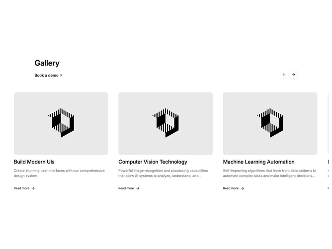
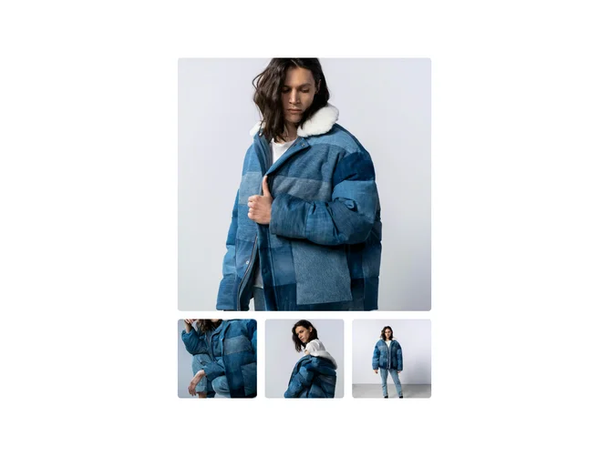
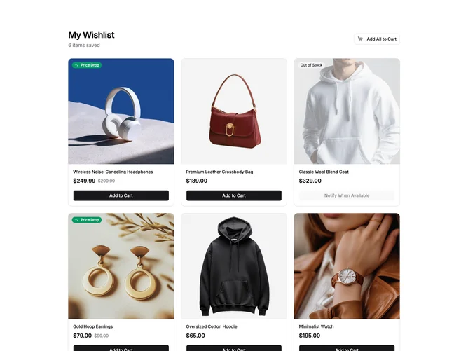
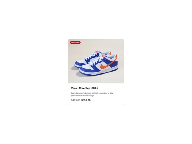
Image card grid with optional header link
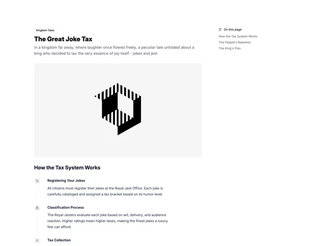
Long-form story with sticky section outline
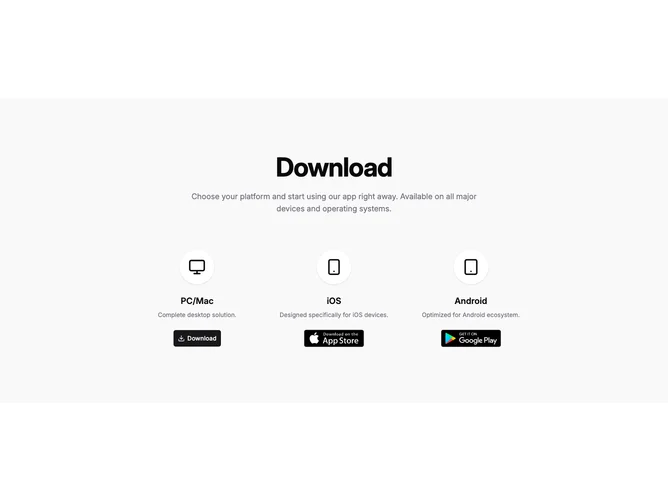
Minimal three-column downloads
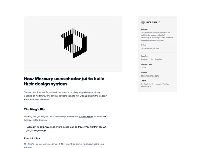
Case study article with company sidebar
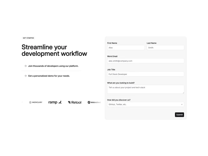
Demo booking form with benefits and logos
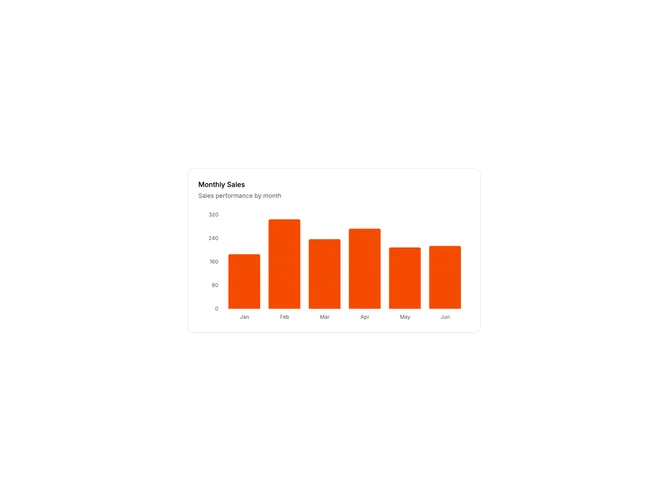
Bar Chart Card
Feature accordion with paired image panel
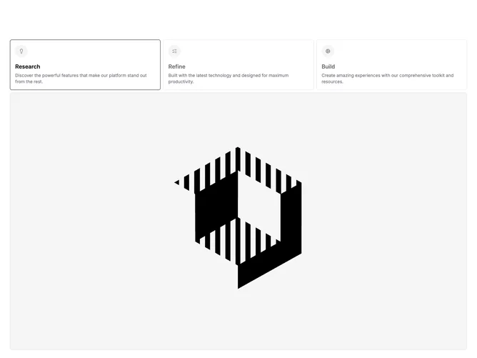
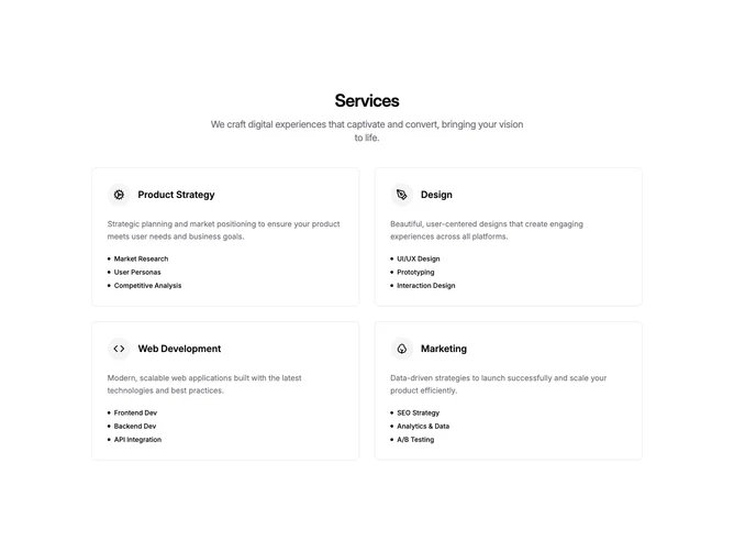
Narrow header with bordered feature cards
Hero with wide image and three feature columns
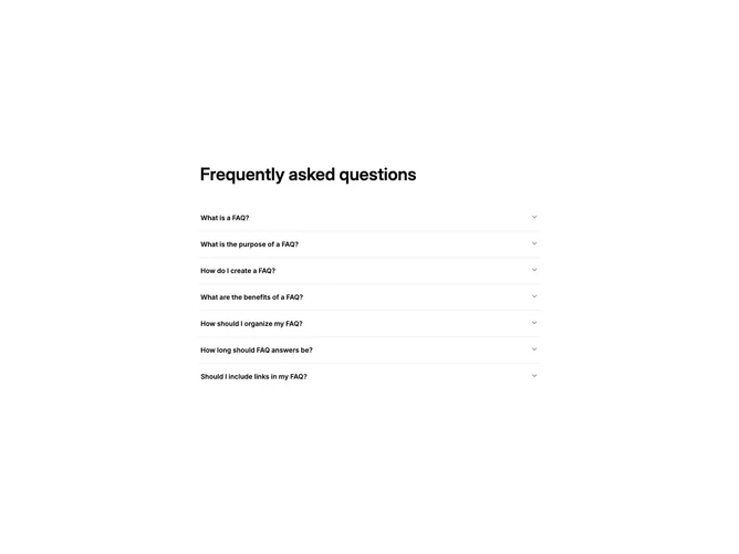
Centered accordion FAQ block
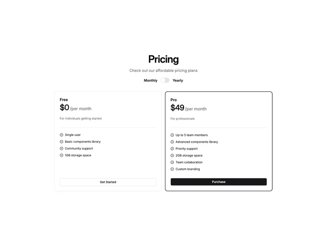
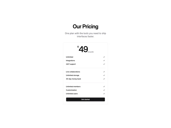
Classic two-plan pricing with billing switch
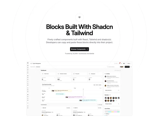
Centered hero with ring backdrop
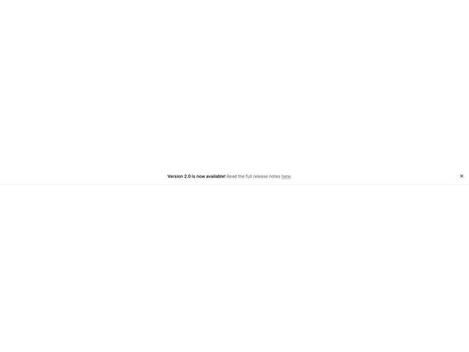
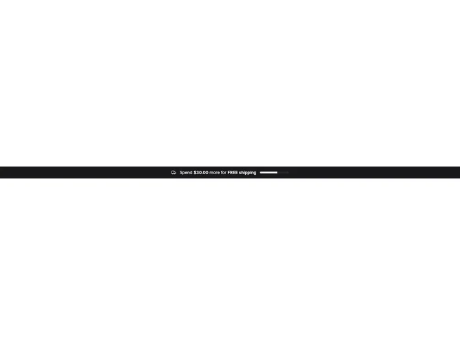
Full-width dismissible announcement bar
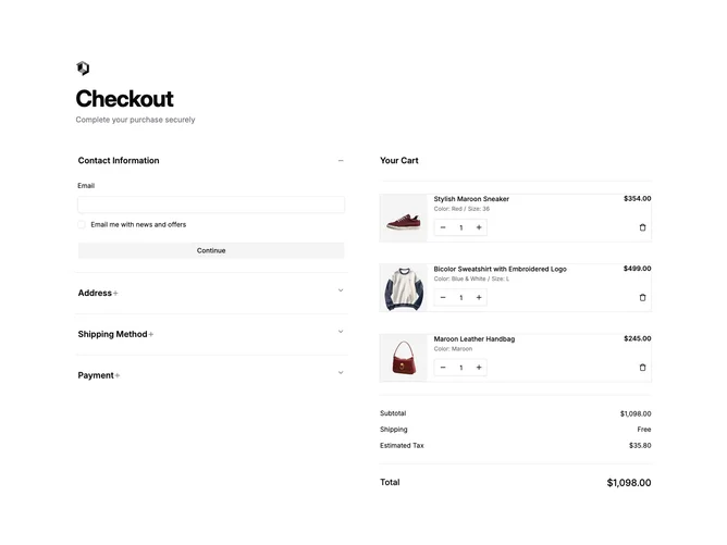
Accordion checkout with cart and payment steps
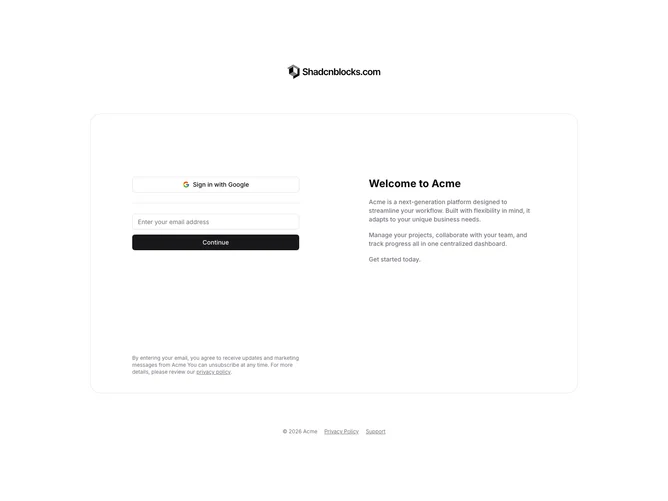
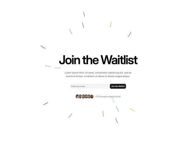
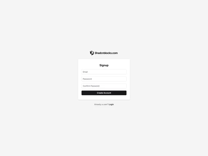
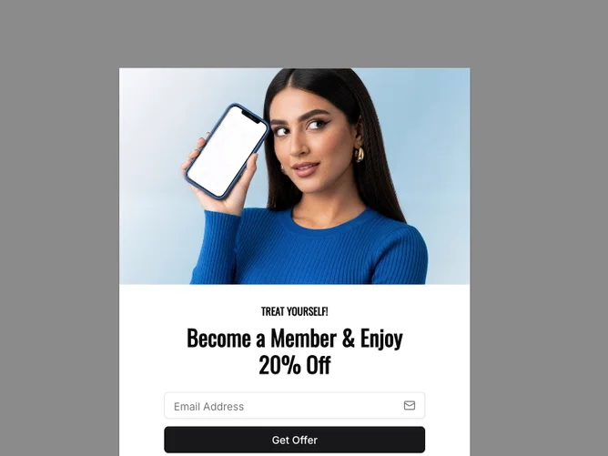
Two-Column Invite with Email Form
Basic Sidebar with Groups
Stacked icon tabs with feature imagery
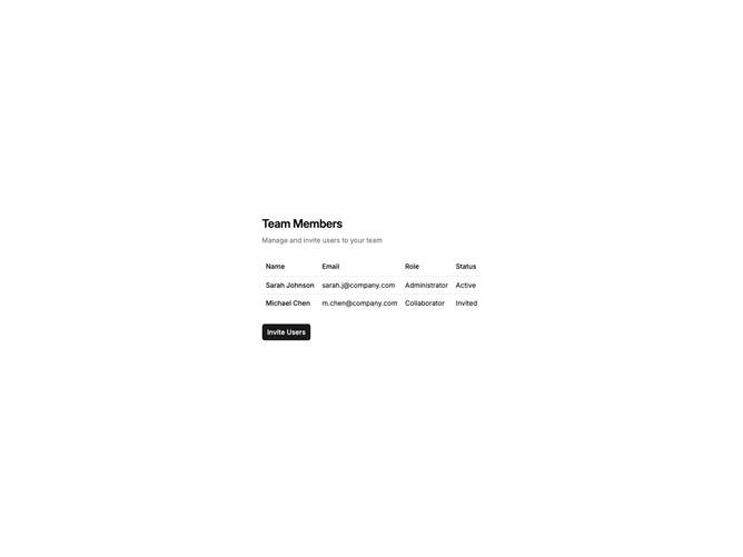
User Table with Dialog Invite
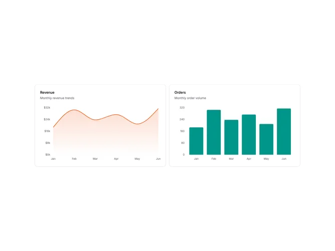
Two Charts Side by Side
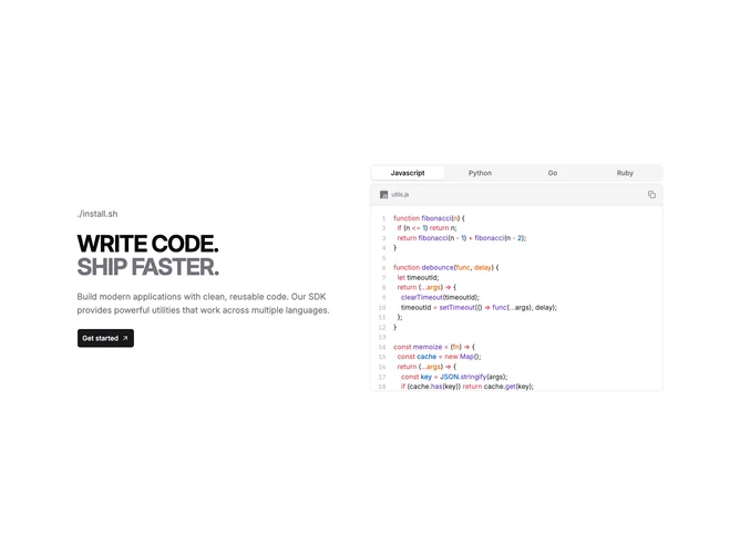
Tabbed database query examples in multiple languages
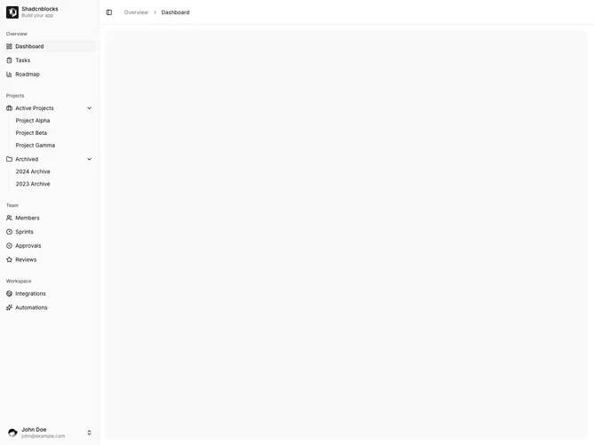
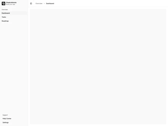
Sidebar Shell with Breadcrumbs
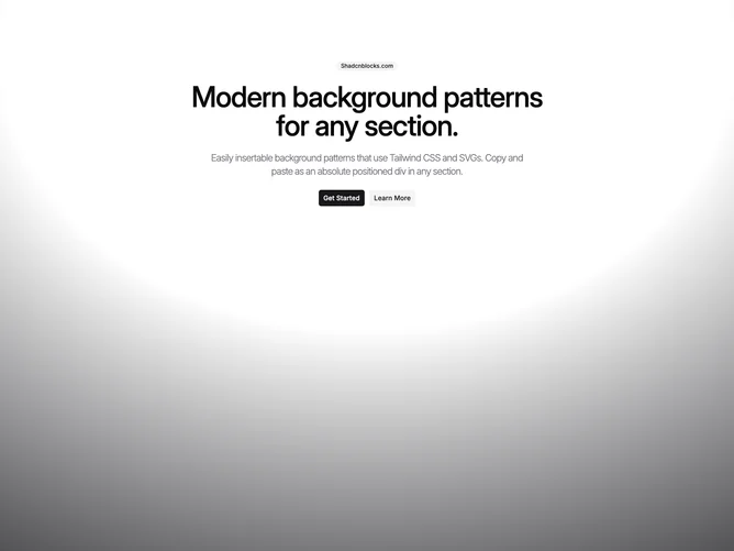
Full-screen radial gradient background pattern

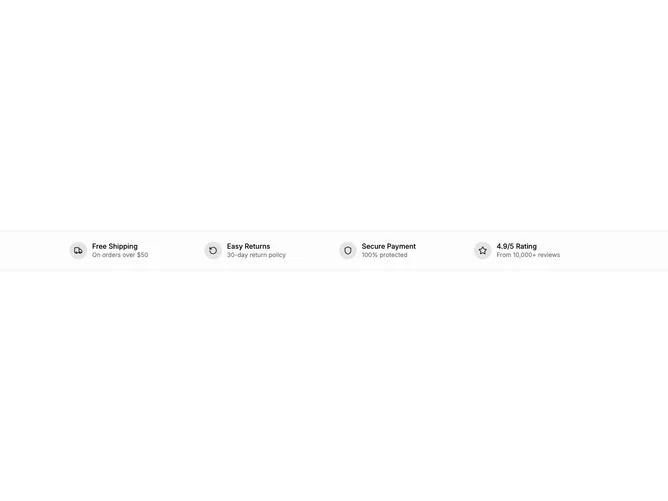
Bordered CTA with icon label and single action
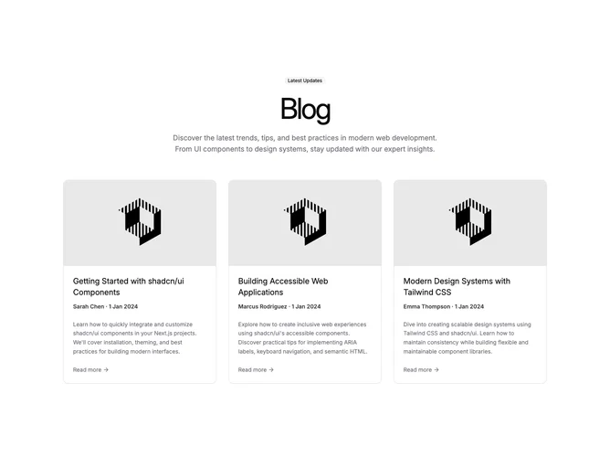
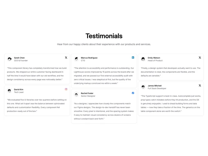
Centered blog cards with read-more links
Split hero with handset frame and split headline line
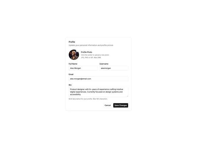
Basic Profile Form
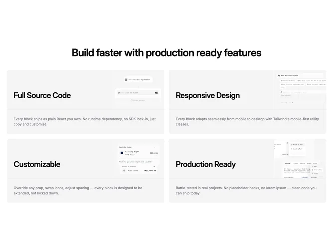
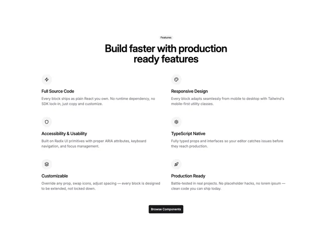
Centered intro over four-panel feature matrix
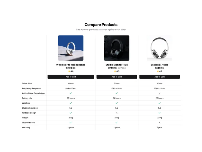
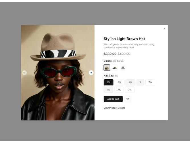
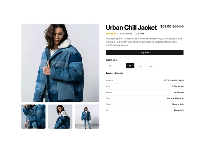
Side-by-side product comparison with specs and cart

Mouse-Interactive Glass Shader
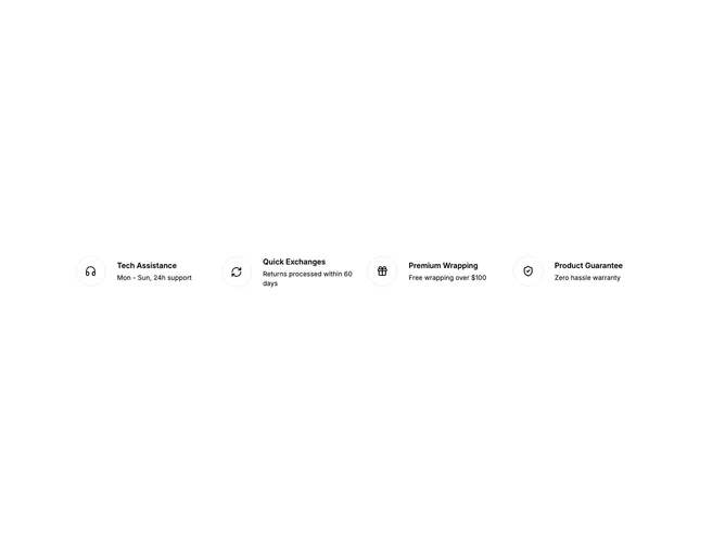
Icon reasons with centered call to action
Split feature row with image and dual actions
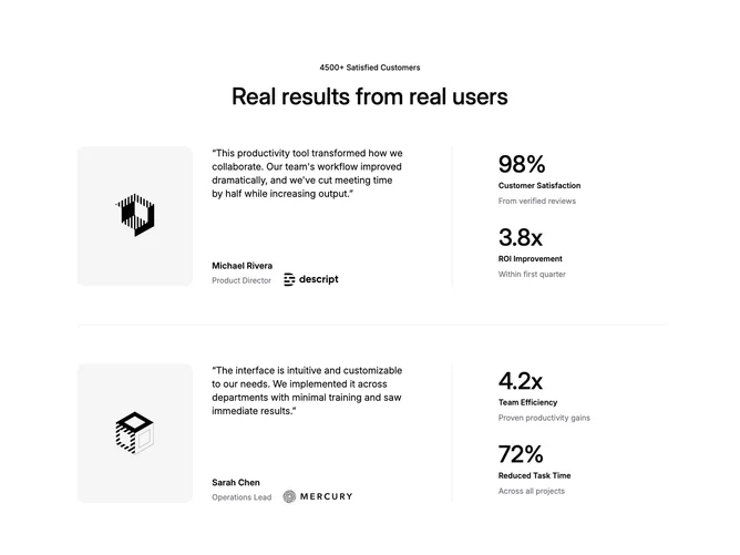
Case studies with quotes and metrics
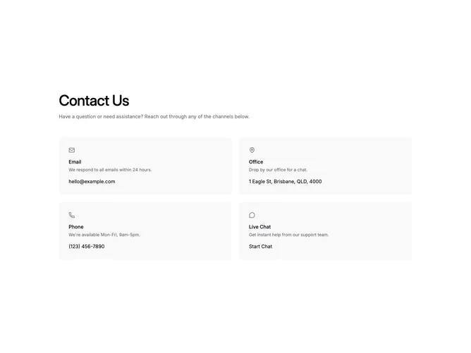
Grid of contact method cards
Split hero with review strip and tall photography
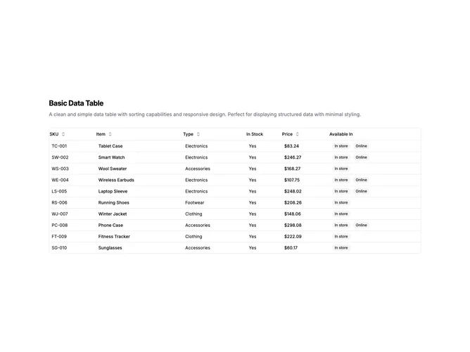
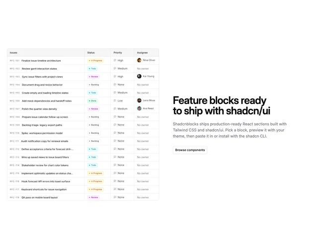
Basic Data Table
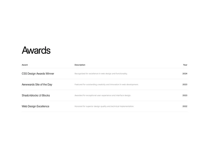
Awards table with linked rows
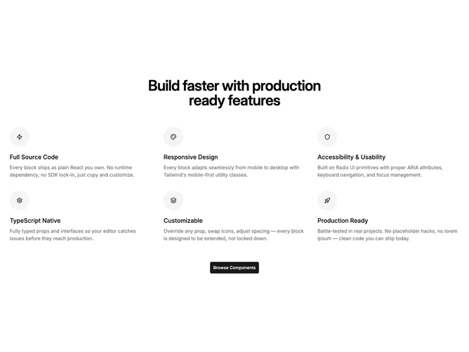
Six-up icon grid with centered intro
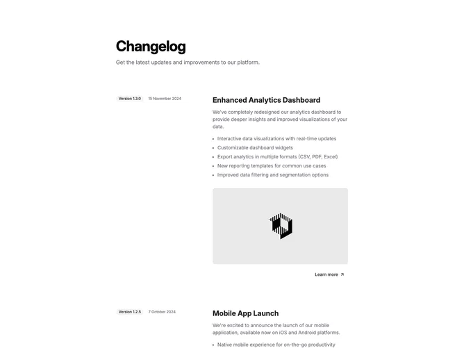
Changelog with sticky version and date rail

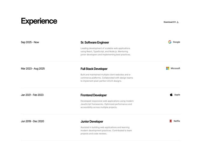
Work history rows with CV download

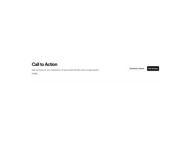
Call to action with top border separator
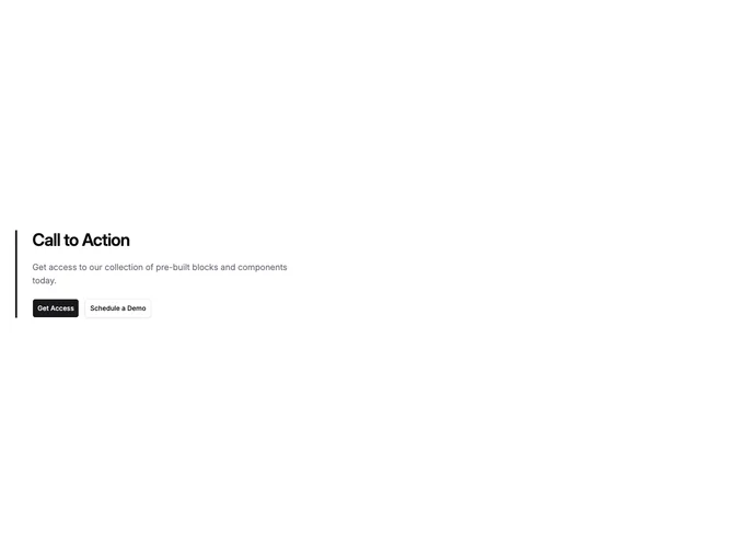
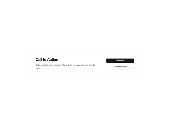
Call to action with left border stripe
Inline split call to action
Bordered grid split call to action
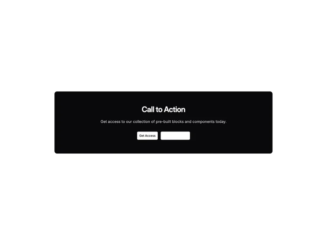
Inverted card call to action

Dashed outline card call to action
Logo Grid Without Headline