
Cta 38 block design & features
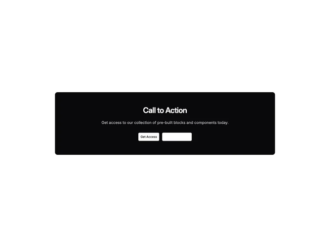
A centered call to action built with shadcn/ui sits inside a rounded rectangle whose background pulls from the foreground semantic token while text swaps to the background token for contrast. Supporting copy lowers opacity slightly so the headline remains dominant. Two buttons balance solid and outline treatments tuned to read clearly on that dark slab.
Elevation comes entirely from inversion rather than shadows. Responsive padding expands at each breakpoint, keeping whitespace generous on large screens. The card floats on whatever page background surrounds it, creating a decisive focal tile.
Bold and interruption-driven compared with border-only CTAs, this pattern leverages theme tokens instead of literal black so it survives light and dark themes. Complexity stays moderate; uniqueness is chiefly chromatic punch.
Compact layouts still respect touch targets thanks to roomy vertical padding inside the inverted surface.