Help 1 block design & features
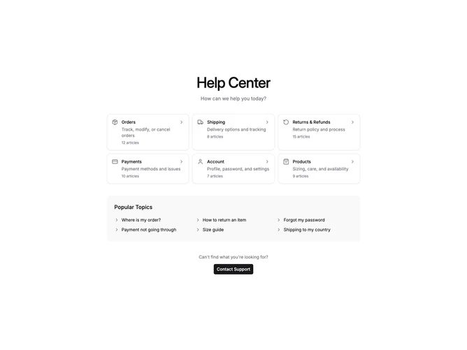
Help1 is a centered help center section with two stacked areas: a grid of category cards at the top and a popular topics list below. Each category card shows an icon, title, description, article count, and a chevron indicator. The popular topics section lists clickable links in a multi-column grid. A contact support button sits at the bottom.
Light background throughout with cards having visible borders. The category icons use muted foreground color without backgrounds. Cards have subtle hover state with muted fill. The popular topics section has a rounded container with semi-transparent muted fill. Clean typography with medium weight headings.
Straightforward help center layout with a browse-first approach. The category cards encourage exploration while popular topics provide quick access to common questions. Minimal complexity with no interactive state beyond hover effects. Requires category data with icons, titles, descriptions, and article counts.