Product Gallery 1 block design & features
The ProductGallery1 shadcn component presents a visually engaging carousel of product images designed to capture user attention. This shadcn ui element functions as a dynamic gallery that allows users to seamlessly navigate through a collection of high-quality product images. By integrating a carousel structure, it offers a fluid browsing experience, perfect for displaying products in an appealing manner, thus enhancing user engagement with visual content.
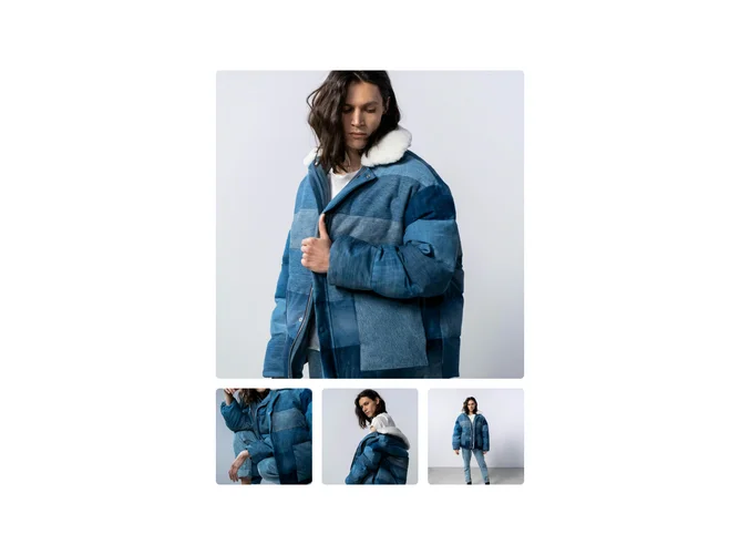
In more detail, the ProductGallery1 shadcn block is meticulously crafted to accommodate different screen sizes, with special features that set it apart. It showcases a flexible design, where on wider screens, the carousel's active transitioning feature is disabled, offering a static yet comprehensive layout through a grid. This component leverages responsive AspectRatio blocks to maintain the aesthetic integrity and uniform visibility of images, ensuring they are displayed crisply and attractively. Each image supports different resolutions through the srcset attribute, optimizing load times and ensuring clarity across devices. Unique grid arrangements, such as having the first image span the entire width on larger displays, prioritize key visuals, making this component especially useful for highlighting feature products in a collection.