

Feature 73 block design & features
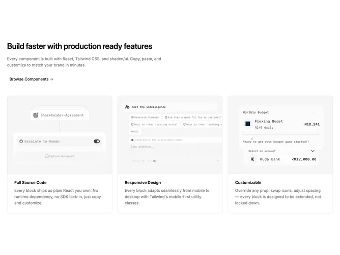
Feature73 is a marketing feature section built with shadcn/ui: a text block on top with a large heading, optional supporting paragraph, and an optional link rendered as a text button with a trailing arrow. Below that, three cards link their hero images to detail pages; each card stacks a wide landscape image above a title and short body copy inside a padded, bordered panel.
The layout is light, with tight tracking on headings and muted foreground for descriptions. Cards use rounded corners and a single border without heavy shadow; images use a fixed aspect ratio and respond to hover with a simple opacity change. Spacing is roomy, with clear separation between the header block and the grid.
This is a straightforward, common card-grid pattern with a polished default skin rather than a highly custom layout. The optional header link is the main interactive accent beyond the image links.
On small viewports the grid stacks to a single column; from the medium breakpoint upward it becomes two columns, then three on large screens, so the section scales predictably without hiding content.