Project 1 block design & features
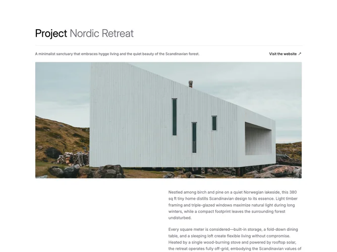
The section opens with a split header that pairs a bold project title with a lighter subtitle, separated by a bottom border. Below the header sit a short description paragraph and an external link, followed by a full-width hero image inside a bordered, rounded container. A right-aligned text column with two paragraphs and a vertical list of label-value metadata rows completes the narrative portion. A two-column image grid closes the layout. All major content groups use a fade-up-on-scroll animation built with Shadcn UI utilities and Framer Motion.
Surfaces rely on semantic border and foreground tokens throughout. The hero image uses a wide 16:7 aspect ratio, and grid images sit inside rounded containers with thin borders. Typography alternates between full-weight foreground headings and lighter muted-foreground body text, with uppercase tracking on metadata labels. The scroll-triggered fade-up applies a 24 px vertical offset and 0.8 s eased transition, staggered by a short delay per section.
The overall feel is editorial and restrained, leaning on generous whitespace and a single accent color for the external link. Complexity is low since the block has no interactive controls beyond the link, but the scroll animation adds a polished layer of motion.
On smaller viewports the two-column image grid collapses to a single column, and the metadata rows stack their label and value vertically instead of side-by-side.