Product Detail 1 block design & features
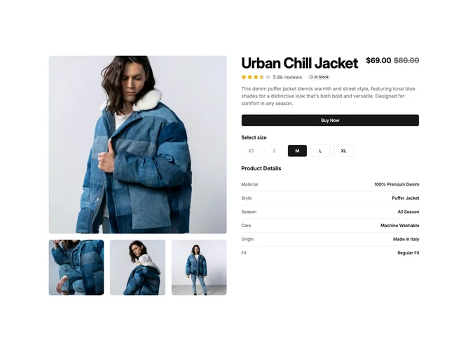
The component lays out a detailed product display block that combines various elements for presenting a product comprehensively. Utilizing a central image carousel, this shadcn block showcases a product gallery, allowing a user to flip through a set of images, thus offering a visually immersive experience. The right section of this shadcn component provides essential product details, including an intricate ratings display, price options, availability badges, and even interactive elements like a "Buy Now" button and customizable product options with a standout radio group for size selection, tailored for usability and boosting customer engagement.
This shadcn ui component is distinctively designed with a thoughtful combination of form elements and visual aids that make product selection intuitive. The use of an advanced image carousel enhances user interaction by allowing seamless navigation through product images, while a detailed ratings system visually encapsulates customer feedback with a combination of full, half, and empty star icons. Additionally, the inclusion of stock status indicators within options provides customers with real-time inventory insights, a unique feature that strategically optimizes the shopping experience. This block exemplifies excellent design practices, catering to users who want a complete, informative, and interactive product detail overview on one page.