Stats Card 1 block design & features
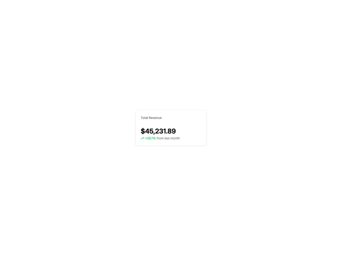
StatsCard1 is a compact metric card with a title label at the top, a large value display, and a trend indicator below. The trend shows percentage change with an up or down arrow icon and color-coded text indicating positive or negative movement.
Light card surface with muted title text and bold value typography. The trend indicator uses green for positive changes and red for negative, with a small directional icon. Minimal padding with tight vertical spacing between elements. Static layout with no animations.
This is a basic, functional stats card following shadcn-default styling. The trend indicator with color-coded direction is the main visual feature. A straightforward implementation suitable for any dashboard KPI display.
The card maintains a fixed max-width but can flex within grid layouts. Works well in rows of 3-4 cards on desktop, stacking to single column on mobile.