Chart Card 1 block design & features
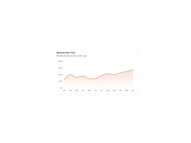
ChartCard1 is a dashboard-ready area chart wrapped in a card container. The card has a title and description header followed by a full-width area chart with X and Y axes, horizontal grid lines, and interactive tooltips. The area fill uses a gradient that fades to transparent.
Light card surface with the chart using theme colors. The grid uses dashed horizontal lines for subtle visual guides. Axes show month labels and currency-formatted values. The tooltip appears on hover with a dashed cursor line. The area stroke is solid with a gradient fill below creating depth.
This is a foundational chart card for time-series data visualization. The combination of card container, descriptive header, and fully-featured chart makes it ready to drop into any dashboard. Clean implementation following shadcn chart patterns. Suitable for revenue, traffic, or any metric tracked over time.
The chart is responsive and scales with the card width. The fixed height ensures consistent layout in dashboard grids.