

Feature 51 block design & features
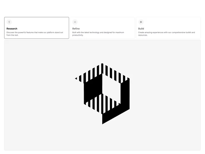
This block built with shadcn/ui uses bordered tab triggers as rich list items: each trigger combines a circular muted icon container, a bold heading line, and a muted descriptive paragraph that stays visible even before selection on wider layouts. Selecting a tab swaps a large illustrative image below the trigger strip, keeping narrative text and imagery paired. A default tab can be marked so the story opens on a specific item.
Borders and flat backgrounds keep focus on readable copy and icon silhouettes. On small screens the triggers stack full width like a vertical chooser; from medium breakpoints onward they relax into a horizontal row with icon and heading pairing that tightens into a column-like alignment at certain widths. Image transitions rely on simple opacity timing rather than dramatic motion.
The design feels like a guided product tour with lightweight chrome. It is moderately complex because each tab carries icon, title, description, and image assets. Uniqueness sits in the "fat tab" pattern where descriptions live inside the triggers instead of only under the image.
The image area spans the content width under the tab list, and the stacked layout on phones keeps one column of triggers before the viewer scrolls to the visual.