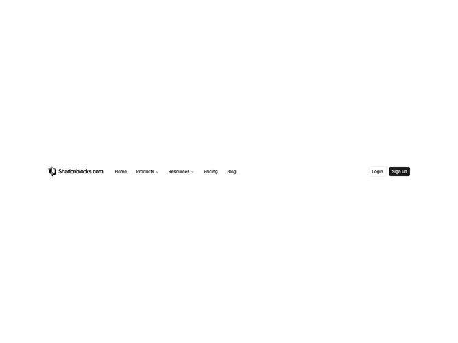
Navbar 1 block design & features
Navbar1 is a full-width header bar built with shadcn/ui, laid out as logo and site name on the left, a horizontal navigation menu in the center area, and login plus signup buttons on the right. Products and Resources open dropdown panels with four links each, pairing a Lucide icon, title, and short description. Home, Pricing, and Blog appear as plain top-level links. On small screens the menu collapses behind a hamburger that opens a slide-in sheet with accordion sections for nested items and stacked auth buttons.
The bar uses a light background with standard foreground text. Dropdown links sit on a popover surface with muted hover states. Icons appear at a consistent size beside link titles. Outline and filled small buttons handle authentication actions. The mobile sheet scrolls vertically when content exceeds the viewport height.
This is a moderate-complexity navbar that follows a familiar SaaS header pattern: icon-enriched mega-style dropdowns without going full-width. It is more capable than a link-only bar but still straightforward to customize with your own menu tree, logo image, and auth URLs. Content-driven setup means defining menu items with optional nested links, icons, and descriptions.
Desktop keeps the full horizontal layout; mobile hides inline navigation and moves links into the sheet. Logo text is hidden on the smallest mobile header row, showing only the mark until the sheet opens.