Product Categories 1 block design & features
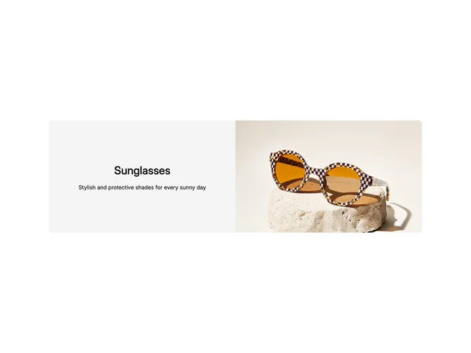
The ProductCategories1 component elegantly displays a product category by combining text elements with an eye-catching image. Positioned within a shadcn block structure, this component effectively utilizes animations to dynamically present the product's title and summary alongside a visually striking image. By separating textual and visual components into a structured grid, it ensures the information is delivered clearly and engagingly, emphasizing the appeal of the featured product category.
Delving deeper, the ProductCategories1 shadcn ui integrates a flexible layout that adapts to various display scenarios, utilizing grid-based design patterns to maximize versatility and aesthetic appeal. It differentiates between textual and visual content using distinct sections within the block, ensuring the title and summary are highlighted through subtly animated transitions. This layout not only supports customization through attributes like className, but it also leverages responsive image handling via srcset and sizes to optimize visuals across devices. This level of detail in the design offers an engaging user experience, making the component a versatile choice for showcasing product categories effectively.