User Profile 1 block design & features
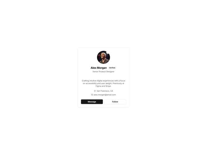
UserProfile1 is a centered card layout displaying user information with a large circular avatar at the top. Below the avatar sits the user name with an optional verified badge, followed by their role or title. The card body contains a short bio paragraph and metadata like location and email with small icons. Two action buttons fill the card footer side by side.
Light card surface on a neutral background. The avatar uses a generous size with rounded-full styling. Text hierarchy flows from the bold name through muted role and bio text. Icon-text pairs for location and email use consistent small sizing. Buttons share equal width in the footer with primary and outline variants.
This is a simple, versatile profile card suitable for user directories, team pages, or profile previews. The centered layout keeps focus on the avatar and name. A clean implementation without complex interactions or decorative elements.
The card maintains its centered layout on mobile with comfortable padding and readable text sizes throughout.