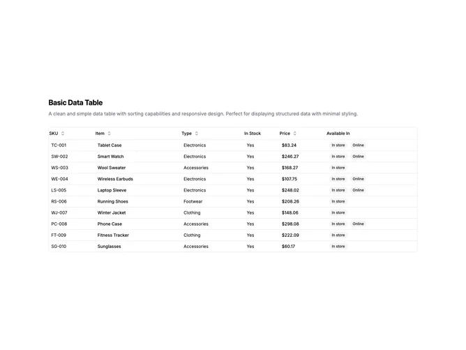
Data Table 1 block design & features
DataTable1 is a centered section with a heading, description, and a full-width data table below. The table displays six columns: SKU, item name, type, stock status, price, and availability badges. Each sortable column header includes a toggle button with directional arrows. The table contains ten rows of product inventory data.
Light background with dark text. The table has a thin border with rounded corners. Column headers use ghost-style buttons that show sort direction icons on interaction. Price values are formatted as currency. Availability displays as secondary badges, sometimes two per row. Compact row height with consistent cell padding. Static layout with no entrance animations.
This is a basic, functional data table with a shadcn-default appearance. The styling is minimal and utility-focused rather than decorative. The sortable headers with arrow icons are the main interactive element. A straightforward implementation that prioritizes clarity over visual flair.