

Process 1 block design & features
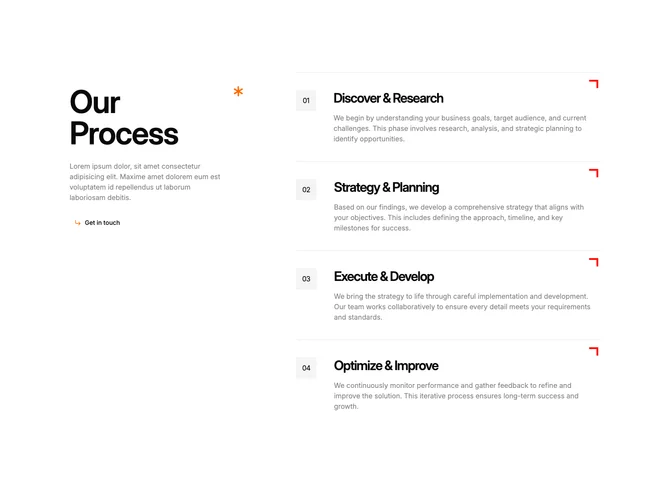
Process1 is a two-column process section built with shadcn/ui, using a six-column grid where the left two columns hold a sticky sidebar and the right four columns list numbered steps. The sidebar contains a large heading with a decorative orange asterisk icon, a paragraph of body text, and a ghost-variant Button with a corner-arrow icon. Each step is a border-top-separated row displaying a numbered square, a title, a description, and a small red L-shaped SVG illustration in the top-right corner.
The number indicators sit inside square muted-fill containers with tight tracking. Step titles use large semibold text with tighter letter-spacing. Descriptions render in half-opacity foreground for secondary emphasis. The accent color orange appears only on the asterisk and the button icon, while the red SVG corner marks punctuate each row.
The aesthetic is agency-portfolio with editorial influence, mixing geometric accents with generous whitespace. Complexity is low because all content is static and the only interactive element is the contact button. You supply a four-item array of step objects with titles and descriptions.
On smaller screens the sidebar unsticks and stacks above the step list, which becomes a single full-width column. Steps shift from horizontal to vertical arrangement within each row.