Feature 13 block design & features
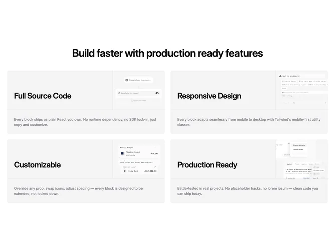
Feature13 opens with a section heading and optional intro, then renders a two-column grid built with Shadcn UI of feature cards. Each card carries a small audience or category label, a linked title, descriptive copy, and an image anchored toward the foot or edge so the art closes the card like a visual capstone.
Surfaces read as light panels with consistent interior padding; imagery interrupts the rectangle enough that rows feel like short stories rather than uniform tiles. Linked titles pick up hover feedback where URLs exist. Label, title, and body tiers stay typographically distinct.
The blend sits between polished marketing and structured comparison content. Strength depends on photography or screenshots because each card showcases its own asset cycle. Moderate complexity comes from repeating the same schema across multiple entries while keeping labels and links meaningful.
The pair of columns usually collapses to one card per row on narrow screens while preserving label, title, body, and image order inside each unit.