
Cta 35 block design & features
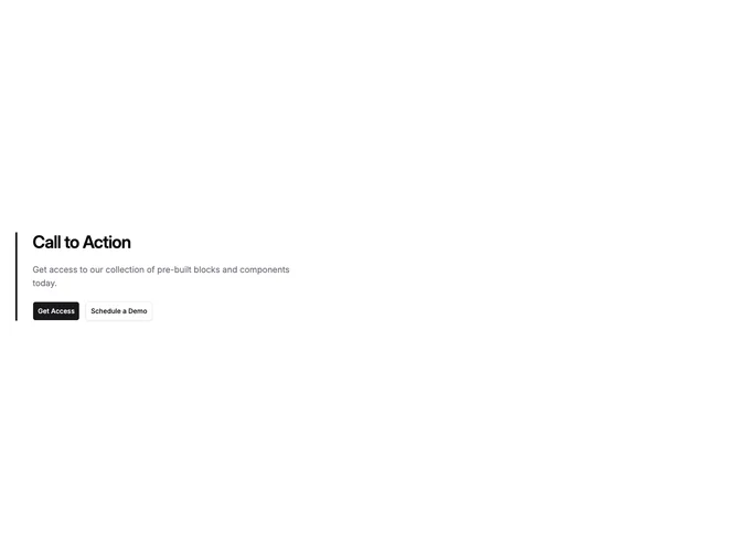
A left-aligned call to action section built with Shadcn UI uses a thick primary-colored border on the start edge as its main accent. The heading, description, and buttons stack vertically with inner padding that indents the copy from that stripe. There is no card fill or shadow; the page background shows through everywhere except the vertical color bar.
The stripe creates a strong vertical anchor and reads like an editorial callout or blockquote rail. Text alignment follows the start edge, and the description typically sits in a constrained line length. Buttons follow default theme shapes and spacing, keeping the composition flat aside from the single saturated bar.
Compared with bordered cards or full-width banners, this pattern feels more documentary and restrained. The colored rail is the distinctive element; complexity stays low and content needs are modest beyond headline, supporting copy, and one or two actions.
The same layout stacks cleanly on mobile with the stripe still defining the block edge so the hierarchy survives narrow widths.