Accept Invite 1 block design & features
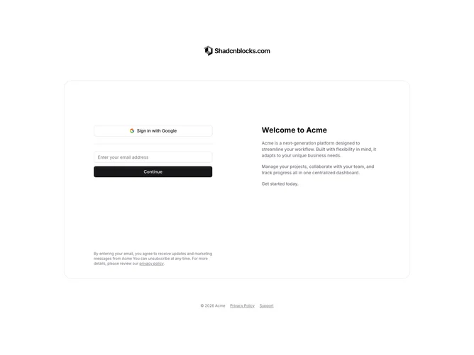
AcceptInvite1 is a centered invitation acceptance layout with a company logo at the top, a two-column content area, and footer links at the bottom. The left column contains a Google sign-in button, a horizontal divider, and an email input form with a continue button. The right column displays a welcome heading with multiple description paragraphs. A disclaimer about privacy policy appears below the form.
Light background with dark text throughout. The content area has a rounded border on tablet and larger screens. Buttons use standard shadcn styling with the Google button showing an outlined variant. Generous vertical spacing between sections. The layout is static with no entrance animations.
This follows a standard SaaS invitation pattern with a clean, minimal appearance. The two-column layout separates authentication options from welcome messaging. A straightforward implementation without decorative elements beyond the bordered container.