
Cta 39 block design & features
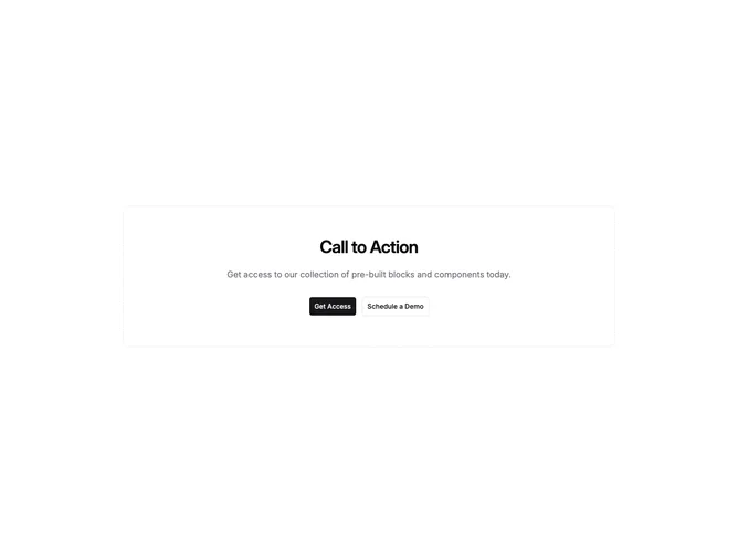
A centered section using Shadcn UI encloses headline, descriptive paragraph, and buttons inside a dashed rounded rectangle without an interior tint. Padding scales across breakpoints and everything stays axis-centered so the dashed frame reads symmetrically against the viewport.
Compared with solid strokes, dashed edges feel tentative and airy, implying an invitation rather than heavy framing. Typography follows standard hierarchy with muted body copy beneath the headline. Buttons pick up ordinary primary and outline semantics so behavior stays predictable.
Quiet and documentation-adjacent, this block suits contexts where saturated cards would overwhelm. Complexity is simple; dashed stroke is the main stylistic differentiator besides typical call to action typography.
Responsive behavior retains center alignment as text wraps while the dashed shell continues to wrap the stacked content.