Product Specs 1 block design & features
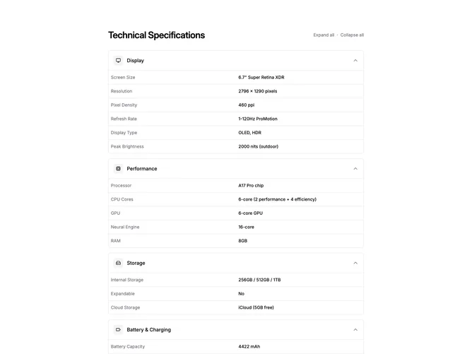
ProductSpecs1 is a versatile and dynamic user interface component that organizes technical specifications into easily navigable categories. Each category is visually represented by an accompanying icon and can be expanded or collapsed to reveal individual specifications. This design allows users to quickly access detailed information without being overwhelmed by text, making it particularly valuable in displaying comprehensive data sets that would otherwise consume extensive space.
The component's distinguishing feature lies in its use of collapsible sections, which enhances user interaction by allowing them to tailor their viewing experience to their preferences. A shared control at the top of the component offers convenient 'Expand all' and 'Collapse all' functionality, providing users with quick shortcuts to modify the view entirely. Each category is accompanied by a ChevronDown icon; its rotation offers a clear visual cue of the category's state. Additionally, the use of the shadcn UI components like collapsibles and tables delivers a consistent and appealing design, fostering a cohesive user experience.