Checkout 1 block design & features
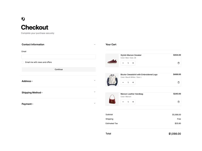
The Checkout1 component is a sophisticated checkout interface that efficiently manages the purchase flow from shopping cart review to finalizing the payment. It leverages shadcn ui elements to create a clear, step-by-step process utilizing accordion-style segments to streamline user navigation through contact details, shipping information, and payment options. The inclusion of predefined payment methods and input validation ensures secure transactions and a smooth user experience. Furthermore, this component integrates a dynamic cart with adjustable item quantities and reflects immediate updates to the total price, highlighting its utility in an e-commerce context.
Diving deeper into its design, the Checkout1 component capitalizes on the shadcn block architecture to emphasize both functionality and aesthetic coherence. It incorporates essential interface elements such as buttons, cards, and customizable fields, making it versatile for varied e-commerce implementations. A unique feature of this component is its interactive cart panel, where users can modify product quantities or remove items effortlessly. Meanwhile, the accordion layout provides an unobtrusive navigation system, enhancing the checkout process without overwhelming the user. These curated elements make it distinct from other components by promoting a seamless and intuitive shopping experience, emphasizing the adaptability and aesthetic appeal typical of shadcn components.