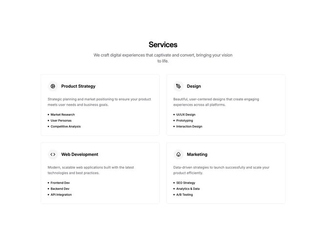
Services 4 block design & features
A centered heading and subtitle introduce the section, followed by four service cards arranged in a two-column grid. Each card contains an icon inside a circular muted background, a semibold title, a description paragraph, and a short list of items prefixed with small filled dots. Cards are outlined with a border and have rounded corners. No shadcn/ui component imports are used.
Cards gain a subtle shadow on hover through a transition effect. Icons are rendered at 24px inside a padded circular container. Descriptions use relaxed line-height in the muted-foreground color, while item labels are set in a smaller bold weight. Internal spacing is generous, with clear separation between the icon-title header, description, and item list.
The overall appearance is clean and conventional, with the bordered cards providing clear boundaries and the dot-prefixed items keeping the layout simple. There is no background treatment on the section itself, relying on the card borders for visual structure.
On smaller screens the grid collapses to a single column and cards stack vertically with consistent padding and gap spacing.