Cta 11 block design & features
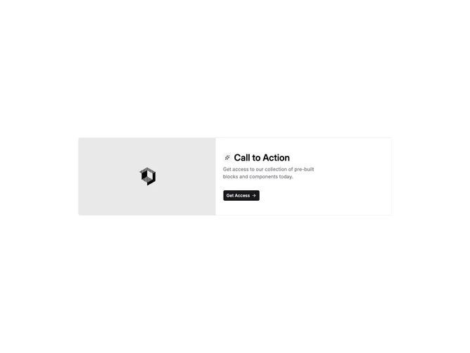
Cta11 is a bordered horizontal card built with shadcn/ui: a media column shows a rectangular image, while the text column pairs a small rounded icon badge with the headline on one row, followed by supporting copy and a single primary button that includes a trailing arrow icon. The layout is tighter than full-bleed heroes and reads like a product teaser inside the page flow.
The outer frame uses a hairline border with square-ish corners on the container, muted backing for the icon chip, and restrained body color for the paragraph. The photograph is aspect-oriented on small screens and stretches along the side on wider breakpoints. Only one action is highlighted, which keeps focus narrow.
It feels compact and utilitarian, closer to an in-feed promo than a dramatic conversion strip. The icon-plus-title row is the signature detail versus image-only splits. Complexity stays modest: swap image, icon, heading, text, and one destination.
Narrow layouts stack the image above the text stack; wider layouts place image and copy side by side with padding inside the bordered card.