Cta 10 block design & features
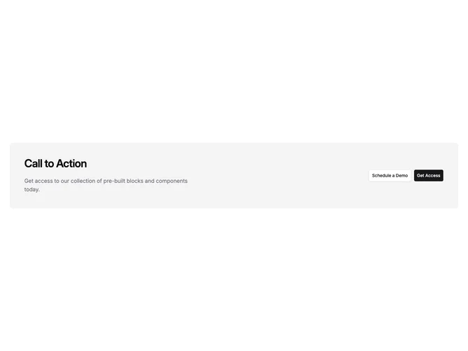
Cta10 is a compact call-to-action band built with Shadcn UI, centered headline and description, and up to two buttons for contrasting actions such as purchase versus learn more. The block is self-contained with no illustration dependency, which makes it easy to drop between sections on marketing pages.
A tinted or accent-backed panel surrounds the text stack while buttons sit on a flex row that wraps cleanly. Typography is headline-forward with concise body lines underneath. The presentation stays flat with rounded corners on the container, which reads as a gentle emphasis rather than a full hero treatment.
Overall it feels like a utility marketing strip: flexible, common, and easy to understand. The dual-button option is the functional hook versus single-action variants. Elaboration is intentionally low; you provide title, description, labels, and destinations.
Narrow screens stack actions vertically while keeping reading order headline, body, then buttons.