Product Quick View 4 block design & features
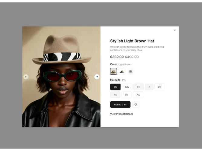
The ProductQuickView4 component presents a detailed view of a product, showcasing a versatile use of the shadcn UI components to create an engaging product visualization experience. This component features a dialog-based layout designed for a closer look at a product’s features, highlighting images, detailed descriptions, and price information. It cleverly combines a carousel for image browsing with a form that allows users to select various product options like color and size. The component stands out by incorporating shadcn block elements to effectively manage product variations and provide users with an interactive design that communicates stock availability seamlessly.
In more detail, the ProductQuickView4 primarily aims to facilitate a streamlined user experience by effectively using shadcn components within a dialog interface. The left side of the layout predominantly displays a carousel that houses high-quality images of the product, enabling users to view the product from multiple angles. The right side comprises detailed product information, including a title, description, and a dynamic pricing component that indicates sale prices if applicable. It differentiates itself through an elegant use of radio groups for selecting product options like color and size, enhanced with visual indicators for stock availability. Additionally, a direct interaction capability is presented with the Add to Cart and View Product Details buttons, providing an interactive way to proceed with or explore the product further. These thoughtful integrations make the component an effective and distinctive tool for product presentations, improving user engagement with shadcn UI elements.