Reviews 1 block design & features
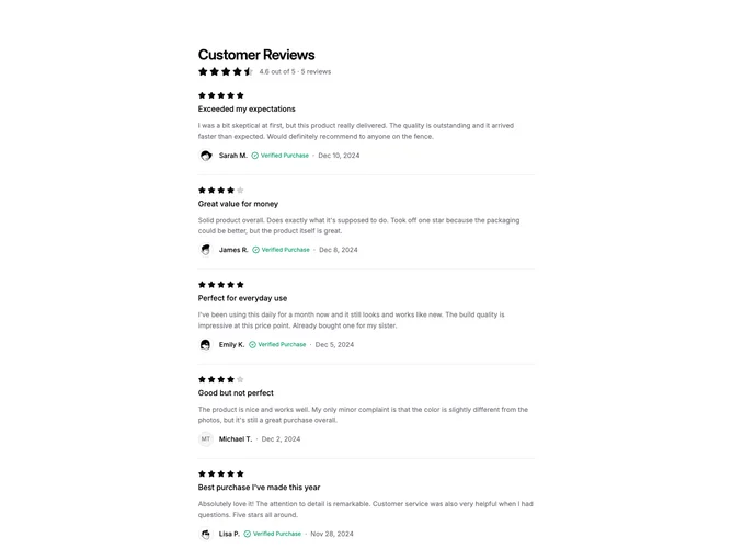
The Reviews1 component offers a dynamic view of customer reviews, showcasing an average rating alongside individual feedback entries. Designed for seamless integration into your application, this shadcn ui block aggregates reviews with high visual clarity, making it easy for users to glean both holistic and detailed insights from customer feedback. By default, it displays a selection of pre-defined reviews, but it is also flexible enough to handle custom data, adapting effortlessly to different contexts and data inputs.
This shadcn component is meticulously crafted to balance design and functionality, emphasizing user experience. It features a clear title section, a robust calculated average rating display, and individual review entries that include ratings, titles, descriptive content, authors with avatars, and verification indicators. The intelligent use of space and separator elements creates an organized and cohesive review list, ensuring that users can easily navigate and digest information. Special attention is given to verified reviews with a distinctive badge, offering additional value and trust for users seeking authentic feedback.