Todo 1 block design & features
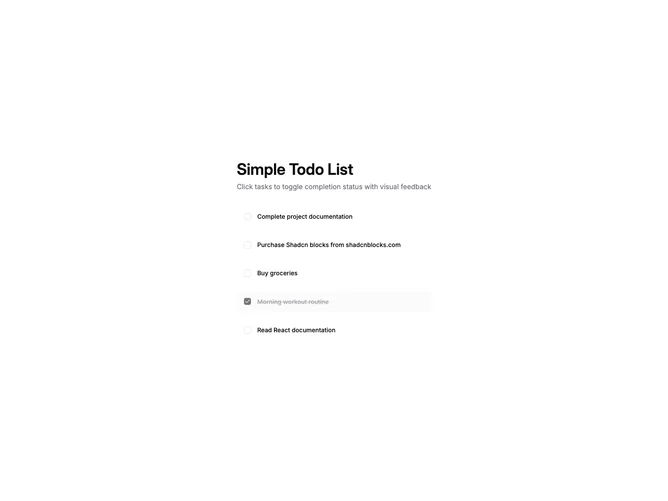
The component is a dynamic and interactive Todo List designed to manage tasks efficiently. It provides a user-friendly experience by allowing users to toggle the completion status of tasks simply by clicking on them. This functionality is emphasized through visual feedback, ensuring tasks are easily distinguished between completed and pending. Each task item is elegantly displayed with a title and a checkbox, reflecting its current state, creating a cohesive interface for task management.
In more detail, the component employs a structured layout using the Shadcn UI design system, specifically utilizing Shadcn blocks to enhance the visual consistency and modularity of the tasks. Each task is encapsulated within Item components that change appearance upon completion. Completed tasks fade with reduced opacity and are visually struck through, distinguishing them from pending items. The use of container divs and grid layouts ensures a clean and organized display, while transitions and border effects afford a polished touch to user interactions. This component stands out due to its efficient state management and intuitive toggling mechanism, making it an effective Shadcn component for integrating a Todo List into any application.