Shadcn Services Grid Blocks

Browse and download 4+ Shadcn UI Services Grid blocks. Built with React, Tailwind and shadcn/ui. These shadcn components are ready to download, copy and paste or install with the shadcn registry.

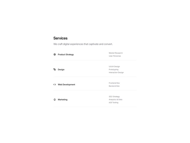
Shadcn Services 3 - Minimal service rows with three-column grid

Minimal service rows with three-column grid

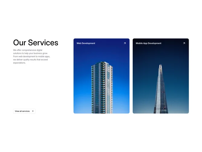
Shadcn Services 11 - Services intro with image cards

Services intro with image cards

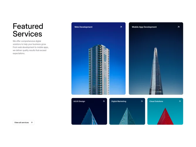
Shadcn Services 12 - Image card grid with intro panel

Image card grid with intro panel

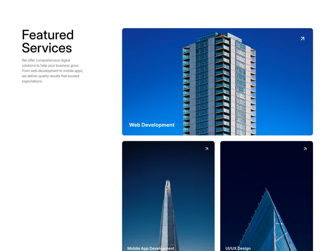
Shadcn Services 13 - Hero image card with portrait grid

Hero image card with portrait grid

Shadcn Services Grid Blocks, Sections & Components

A shadcn services grid block arranges services content in a structured grid layout. Grid designs maintain consistent sizing and alignment, making them ideal for displaying multiple items with visual balance.

Each block is a self-contained React component which you can copy/paste the code or install via the shadcn CLI. You own the code — customize the layout, content, and styling using Tailwind utility classes.