Services 11 block design & features
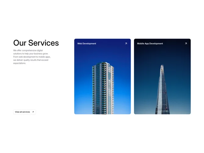
Services11 is a services overview built with Shadcn UI, using a three-column grid on large screens. The left column stacks a large Our Services headline, a short positioning paragraph, and an outline button with an arrow icon to view all offerings. The right two-thirds hold a responsive grid of linked portrait cards, each with a full-bleed background photo, a white title overlay at the top, and a corner arrow that scales slightly on hover.
Cards use a tall portrait aspect ratio with borderless muted shells so photography fills the frame. Framer Motion fades the whole card on hover while the arrow icon grows, giving light motion without layout shift. Imagery is the main visual driver; you need at least two strong photos and service titles with destination URLs.
The mood is agency or studio portfolio: photographic, minimal chrome, and confident typography in the intro column. Moderate complexity with hardcoded sample services today. Mixed image-driven cards plus a small text column.
On mobile the intro stacks above the cards; the service grid becomes one or two columns depending on width, keeping the same hover treatment on pointer devices.