Services 13 block design & features
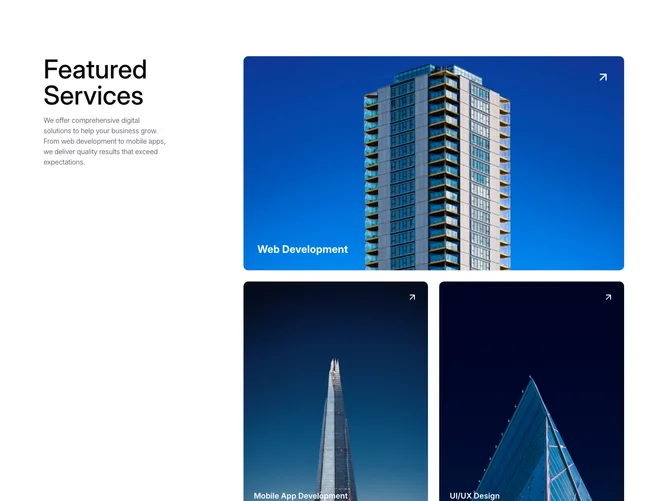
The Services13 component is a shadcn UI element that elegantly showcases a series of services in a visually appealing grid layout. By leveraging motion effects, it enhances user interaction with intuitive animations that draw attention to each service's details. This component provides a consolidated view of various services with a highlighted hero section for a featured service.
Exploring the component further, it consists of a primary section where a large featured service is prominently displayed, harnessing motion to subtly bring title elements to life on hover. Adjacent to this, a grid portrays additional services in resized cards, maintaining uniformity while allowing variability in service prioritization through size attributes. The Services13 component is designed to integrate seamlessly into a broader UI, presenting services through shadcn blocks in an engaging and organized manner. The use of shadcn components alongside tailored styling establishes a modern aesthetic, helpful for digital service representations.