
Services 12 block design & features
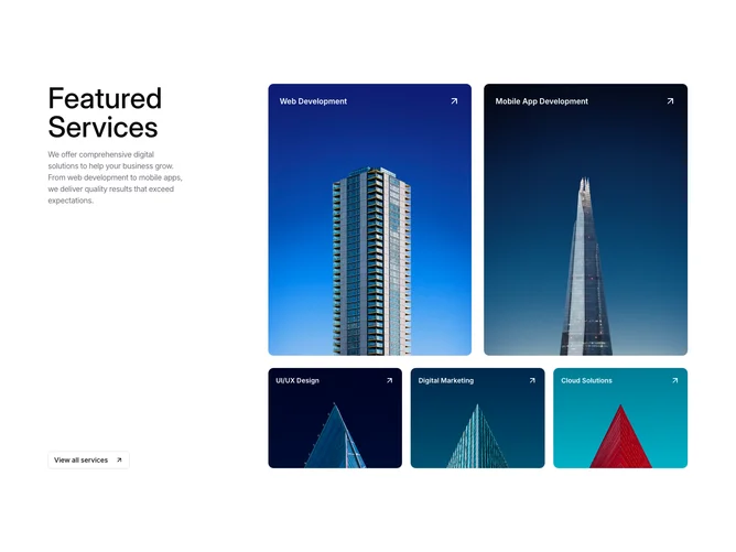
A three-column layout splits an intro panel on the left from a card grid spanning two columns on the right. The intro panel holds a large heading, a narrow description paragraph, and a shadcn/ui outline Button with an arrow icon. The card grid places two tall portrait cards on top and three shorter landscape cards on the bottom row, all built with Card and CardContent components.
Each card fills entirely with a cover image, and a white service title is overlaid near the top alongside an arrow icon. Framer Motion wraps each card link, fading opacity on hover to reveal the image beneath the text. Rounded corners on the cards create a soft, modern shape language.
The composition feels editorial and image-forward, letting photography dominate while text remains minimal. There is no background color treatment on the section itself, keeping the focus on the card imagery.
On smaller screens the layout stacks into a single column, with the intro panel appearing above the card grid and cards reflowing into a single-column sequence.