Shadcn About Basic Blocks

Browse and download 11+ Shadcn UI About Basic blocks. Built with React, Tailwind and shadcn/ui. These shadcn components are ready to download, copy and paste or install with the shadcn registry.

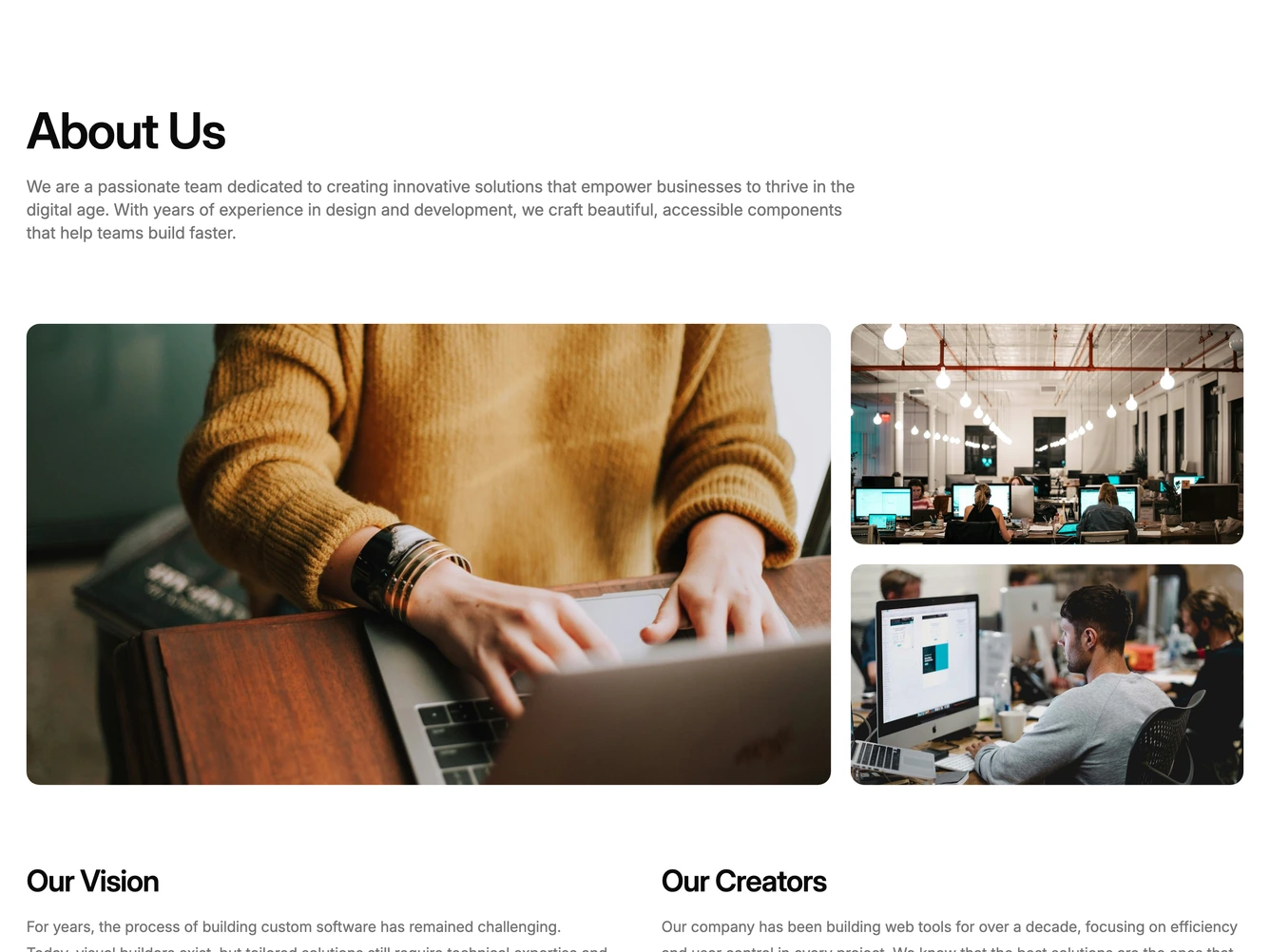
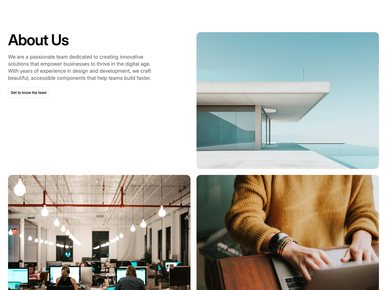
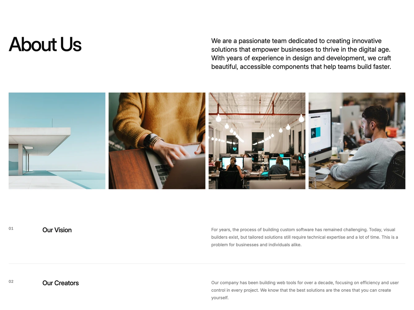
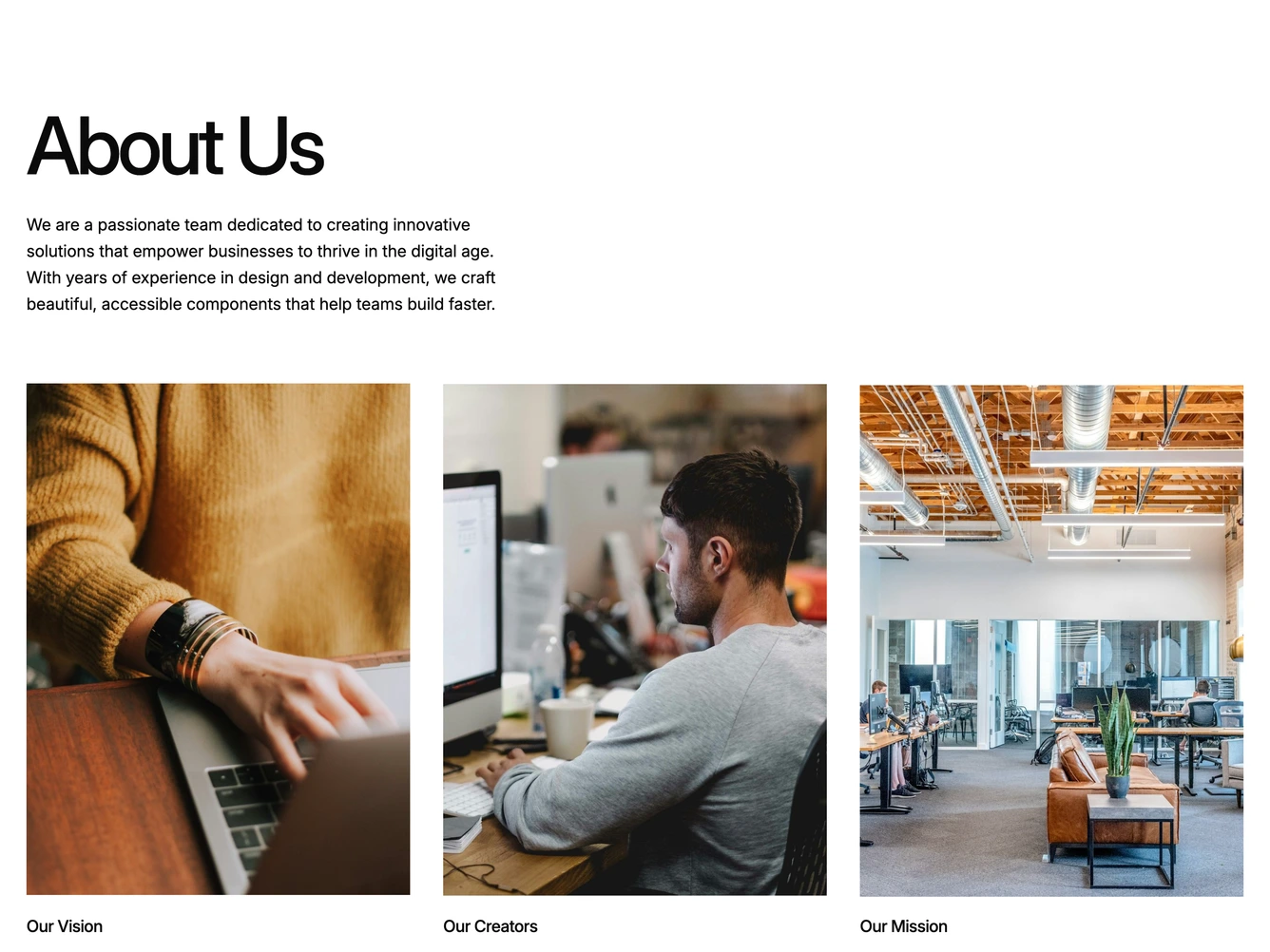
Shadcn About 4 - Vision and Creators with Image Grid

Vision and Creators with Image Grid

Shadcn About 22 - Animated Story with Images

Animated Story with Images

Shadcn About 28 - Two-Column About with Staggered Images

Two-Column About with Staggered Images

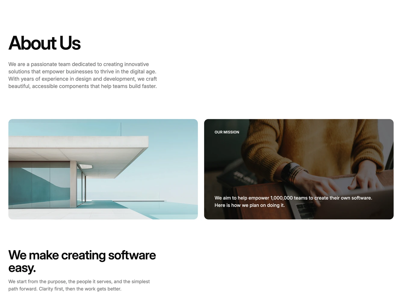
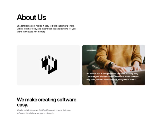
Shadcn About 29 - Mission panel with text columns

Mission panel with text columns

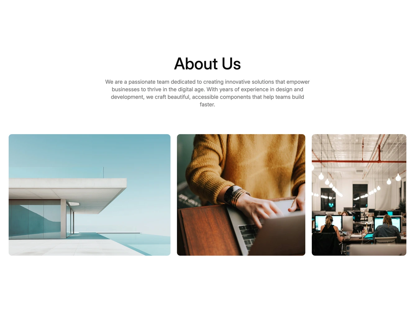
Shadcn About 30 - Centered intro with photo row

Centered intro with photo row

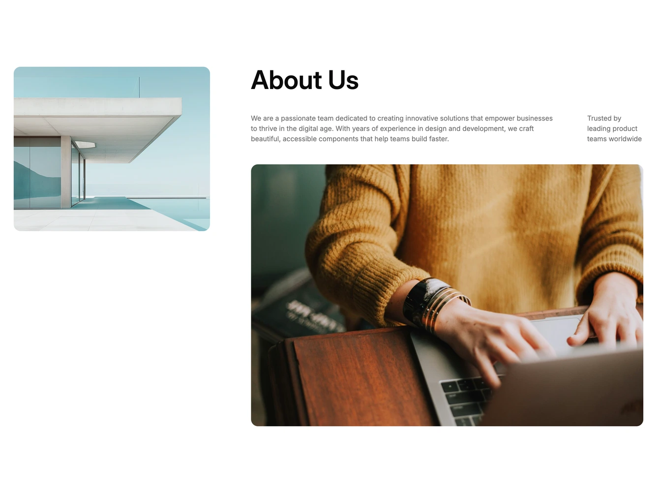
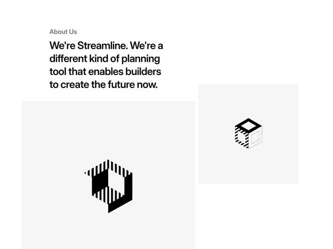
Shadcn About 7 - Product Story with Offset Images

Product Story with Offset Images

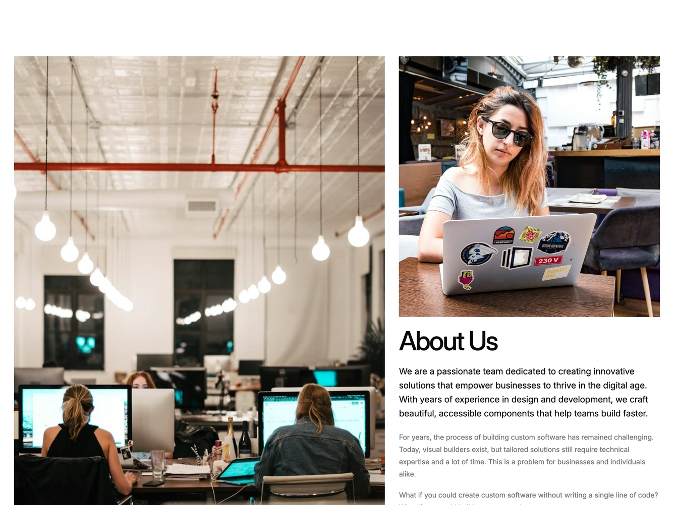
Shadcn About 36 - Photo Mosaic With Story Columns

Photo Mosaic With Story Columns

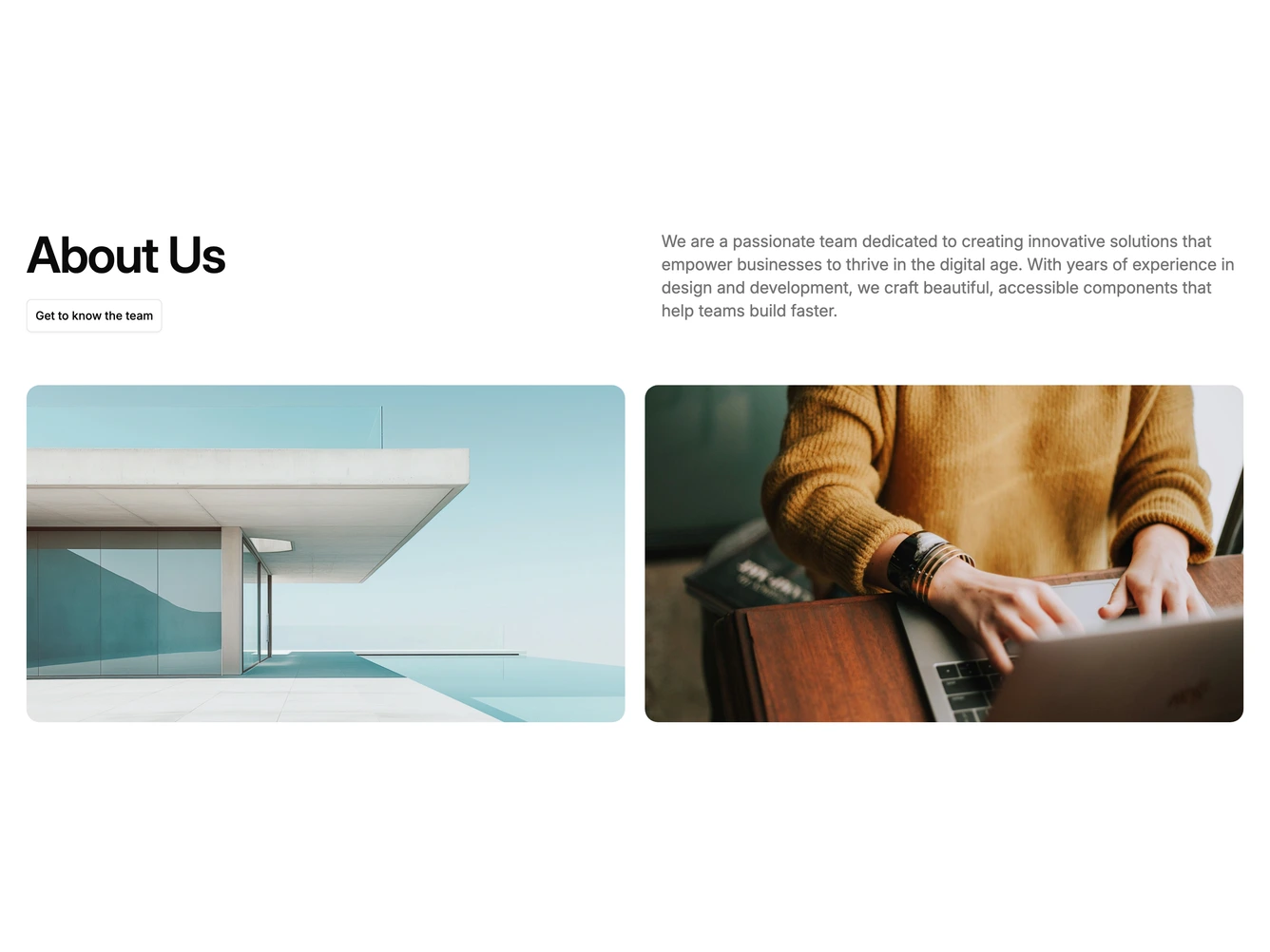
Shadcn About 37 - Editorial Intro With Photo Pair

Editorial Intro With Photo Pair

Shadcn About 38 - Split Intro With Story Columns

Split Intro With Story Columns

Shadcn About 1 - Intro With Story Columns

Intro With Story Columns

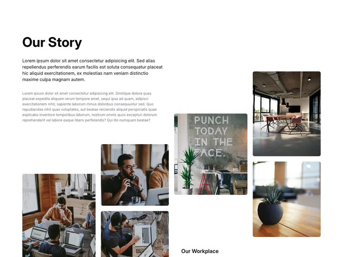
Shadcn About 6 - Story and Workplace Photo Grid

Story and Workplace Photo Grid

Shadcn About Basic Blocks, Sections & Components

A shadcn about basic block is a clean, straightforward about layout with minimal visual complexity. It appears on landing pages, marketing sites, and product pages as a versatile starting point that prioritizes clarity and readability.

Each block is a self-contained React component which you can copy/paste the code or install via the shadcn CLI. You own the code — customize the layout, content, and styling using Tailwind utility classes.