About 1 block design & features
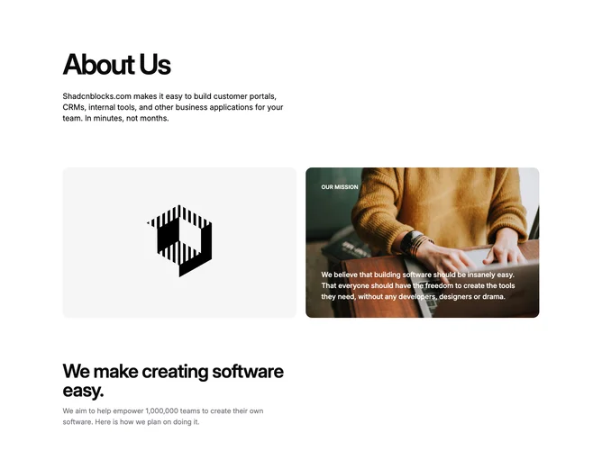
About1 is a stacked multi-section about block. The top section has a large headline and supporting paragraph. Below that is a two-column grid with a placeholder image on the left and a mission statement card on the right featuring a background image with white text overlay. The bottom section contains a secondary headline, paragraph, and a three-column grid of value cards each with an icon, title, and description.
The block uses a light background with dark text throughout. The mission card uses a photo background with semi-transparent text overlay. Icons sit in rounded accent-colored containers. Spacing is generous with large vertical gaps between sections. No animations or hover effects.
This follows a standard corporate about page pattern with a clean, professional appearance. The layout is straightforward and content-focused without decorative flourishes. Moderate complexity due to multiple sections but uses simple styling throughout.
On mobile, all sections stack vertically with the two-column grid becoming single column. The value cards stack in a single column as well.