Shadcn Banner Primary Blocks

Browse and download 5+ Shadcn UI Banner Primary blocks. Built with React, Tailwind and shadcn/ui. These shadcn components are ready to download, copy and paste or install with the shadcn registry.

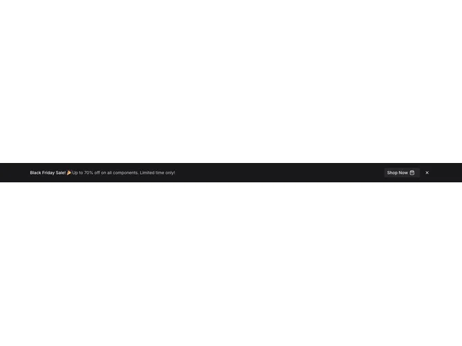
Shadcn Banner 3 - Primary promo banner with shop button

Primary promo banner with shop button

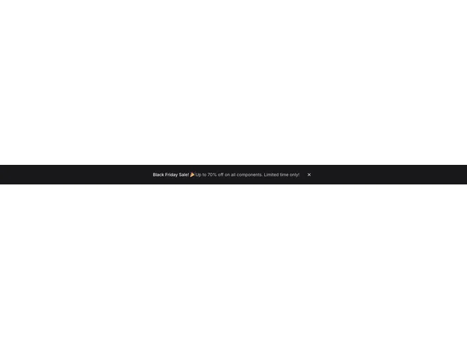
Shadcn Banner 4 - Primary bar banner with dismiss

Primary bar banner with dismiss

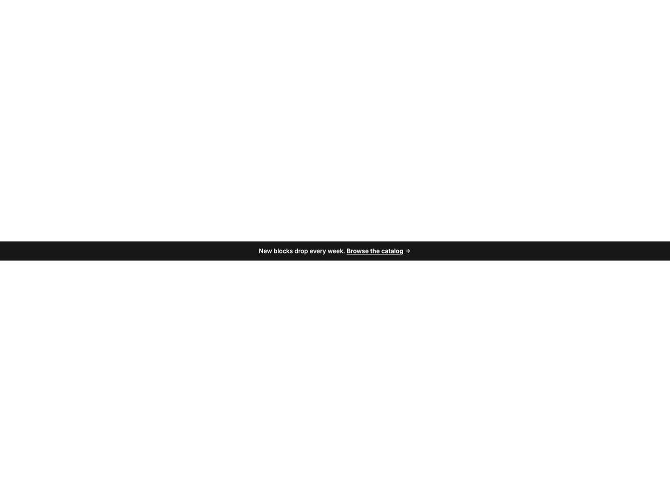
Shadcn Banner 9 - Primary announcement bar with catalog link

Primary announcement bar with catalog link

Shadcn Banner 11 - Primary bar with soft radial and CTA

Primary bar with soft radial and CTA

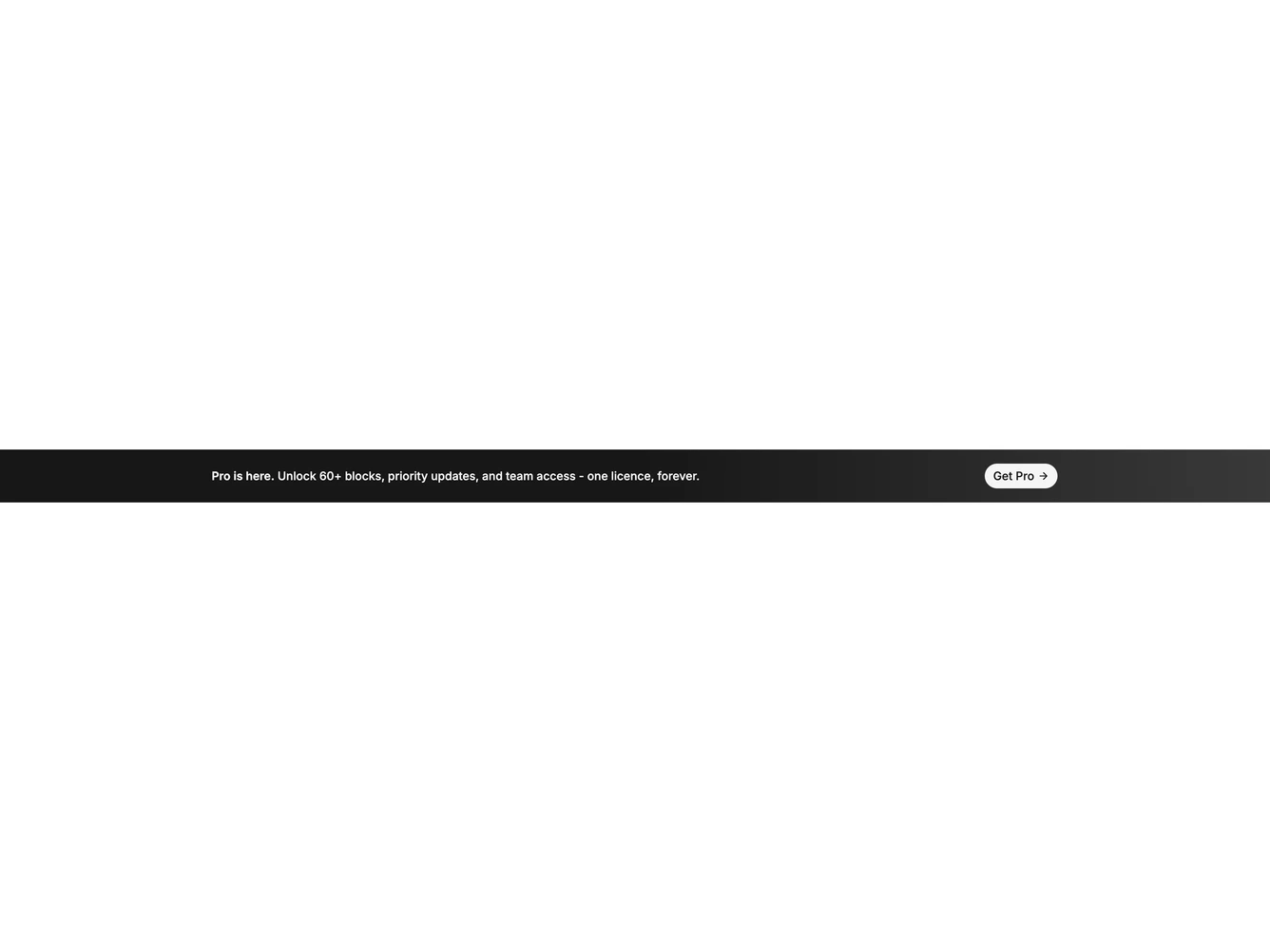
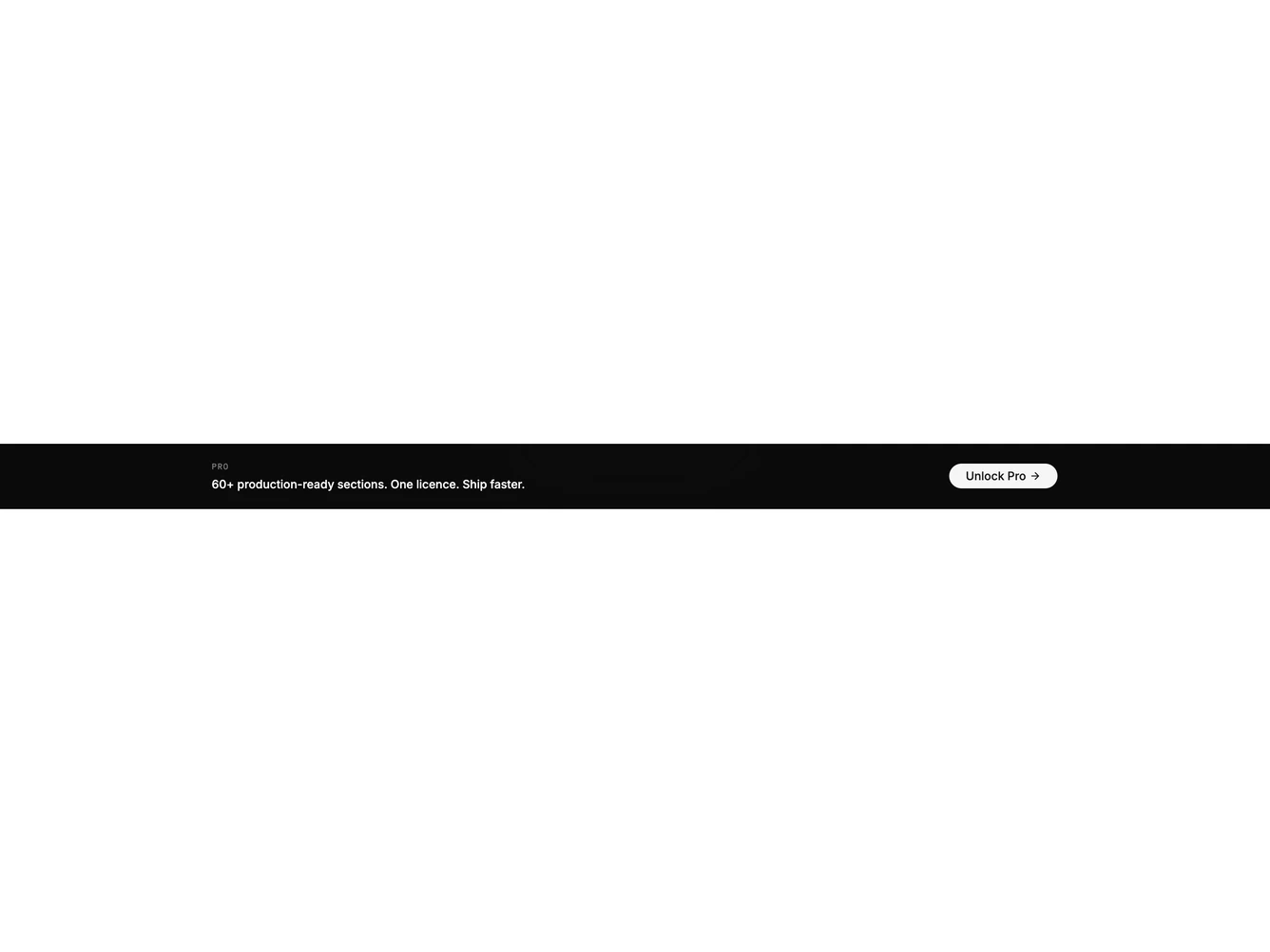
Shadcn Banner 16 - Inverted dark pro upgrade bar

Inverted dark pro upgrade bar

Shadcn Banner Primary Blocks, Sections & Components

A shadcn banner primary block provides a specialized banner layout focused on the primary pattern. It appears on landing pages, product pages, and marketing sites where banner content needs a distinct visual treatment.

Each block is a self-contained React component which you can copy/paste the code or install via the shadcn CLI. You own the code — customize the layout, content, and styling using Tailwind utility classes.