Banner 4 block design & features
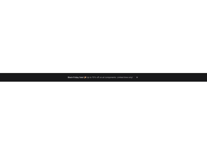
Banner4 is a full-width strip built with shadcn/ui Button ghost icons for dismissal, holding a short headline and a softer secondary line on the primary surface. Content sits in a constrained container and reads as a centered row on wider layouts while stacking vertically on small screens. Only the close controls are interactive in the shipped markup; there is no separate link or pill CTA in the layout.
Looking at the surfaces, the bar uses solid primary fill with primary-foreground typography and a slightly subdued line for the supporting sentence. Icon-only ghost buttons sit at the top-right on mobile and shift inline on wider breakpoints, with one instance using invert styling so the control stays visible against the bar.
This is a straightforward announcement pattern with strong contrast and minimal chrome beyond the colored band. It reads closer to a system banner than a floating toast because it spans the width and anchors content with simple typography.
The dismiss control hides the entire section when used; visibility starts from local state and can be seeded with defaultVisible for controlled-first impressions.