Shadcn UI Field Examples
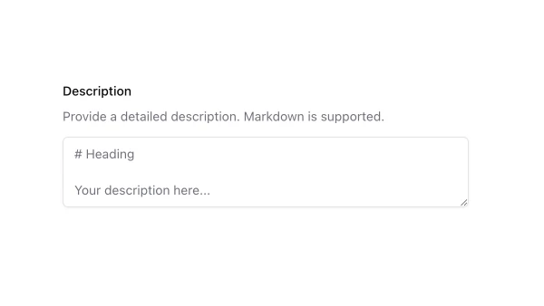
Field components combine labels, inputs, error messages, and helper text into complete form field units. They appear throughout forms for organizing related form elements and providing consistent validation feedback.
These blocks show fields with labels, inputs, validation states, error messages, and helper text. Examples include fields with icons, fields with custom validation, and fields integrated with form layouts.
Shadcn field examples cover the most common patterns: text input fields, select fields, and fields with validation feedback. Browse our blocks to find the configuration you need.
